CSS
Outline:
- What is CSS
- CSS Syntax
- CSS Selectors
- Box Model
- Position
- flexbox
1. What is CSS
1.1 What is CSS?
- CSS stands for Cascading Style Sheets.
- describes how HTML elements (titles, images, paragraph...) are to be displayed on screen, paper, or in other media
CSS Versions: 2.1 -> 3.0
Popular browsers:
Three useful links:
https://www.w3schools.com/cssref/css3_browsersupport.asp (only CSS)
https://www.caniuse.com (HTML, CSS, JavaScript...)
The usage share of web browsers: http://gs.statcounter.com/
1.2 How to add CSS to HTML?
html是骨架 类似的房子框架, css是家具, 地板, 墙的颜色
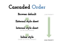
1.2.1 Inline Styles (Highest priority)
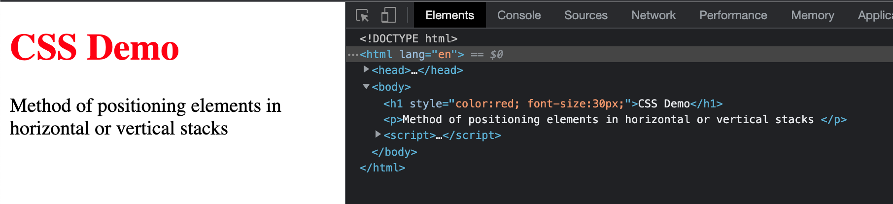
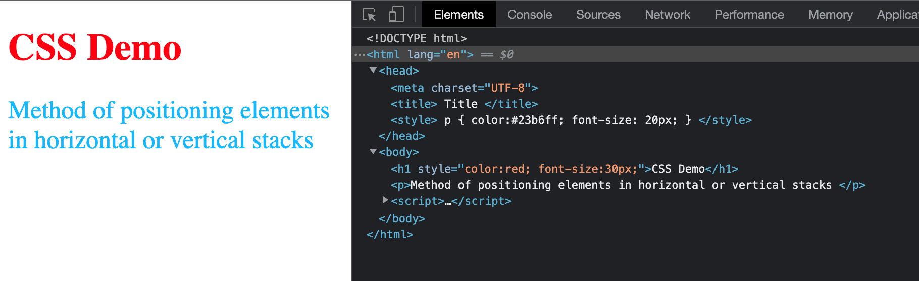
1.2.2 Internal Style(Priority lower than inline style)
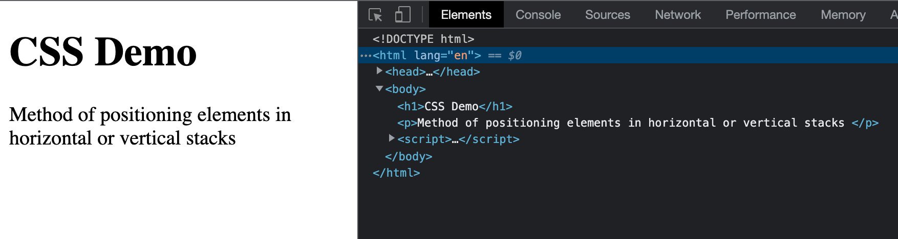
<!DOCTYPE html>
<html lang = 'en' >
<head>
    <meta charset = "UTF-8">
    <title> Title </title>
    <style>
        p {
            color:#23b6ff;
            font-size: 20px;
        }
    </style>
    </head>
<body>
    <h1 style = "color:red; font-size:30px;" >CSS Demo</h1>
    <p>Method of positioning elements in horizontal or vertical stacks </p>
</body>
</html>
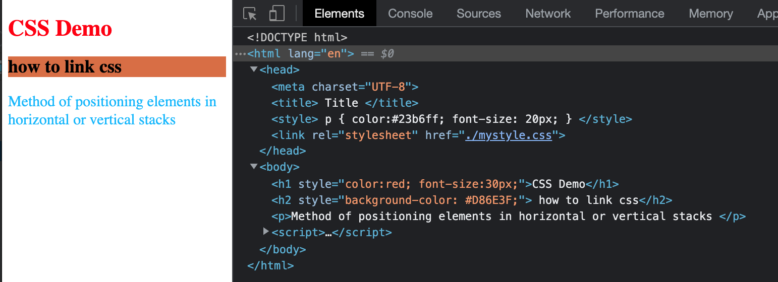
1.2.3 External Style(Priority lower than internal style)
- Each page must include a reference to the external style sheet file inside the
<link>element. - The
<link>element goes inside the<head>section:
Frequently used attributes for <link> tag:
type attr: specifies the media type of the linked document
rel:specifies the relationship between the current document and the linked document
href:specifies the location of the linked document
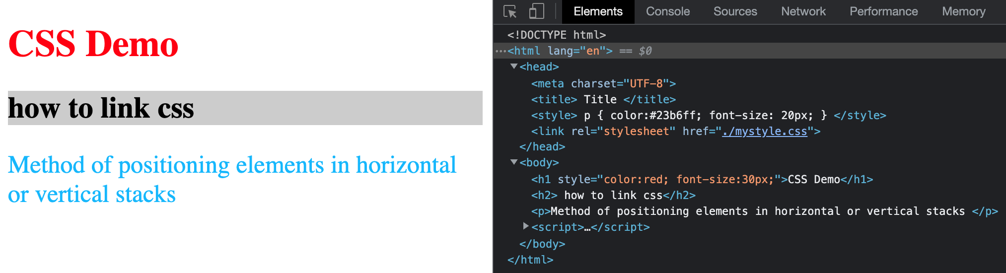
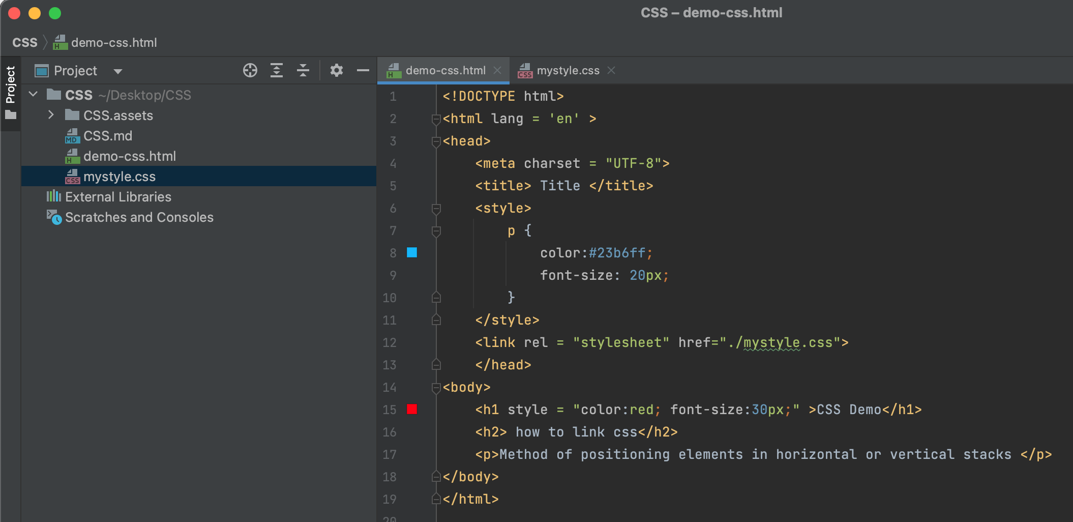
mystyle.css
一般开发用于第三种会比较多, 便于维护.
1.2.4 default style
All tags have default styles. Default style has lowest priority has can been seen in the diagram below.
就近原则
2. CSS Syntax and Selectors
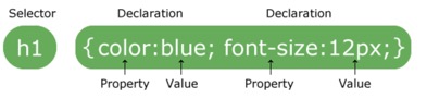
- The selector
points to the HTML element you want to style.
- The declaration block
- contains one or more declarations separated by semicolons.
- each declaration includes a CSS property name and a value, separated by a colon.
- always ends with a semicolon
- declaration blocks are surrounded by curly braces.
2.2 Commonly used CSS properties
width - (宽度), unit: px(像素)
height - (高度)
color - (前景色, 也就是文字的颜色)
background-color - (背景色)
font-size - (字体的大小)
In class exercise 1:
    <!-- set h1 tag font color as red, using inline style -->
    <h1 sytle = "color:red;"> I like web development</h1>

    <!-- set p tag background color to blue, using internal style -->
    <p style = "background-color:blue">I am a paragraph</p>

    <!-- set span font size to 24px, using internal style-->
    <span style ="font-size:24px;">I am a span</span>
<!DOCTYPE html>
<html lang = 'en' >
<head>
<meta charset = "UTF-8">
<title> Title </title>
<style>
p {
color:#23b6ff;
font-size: 20px;
}
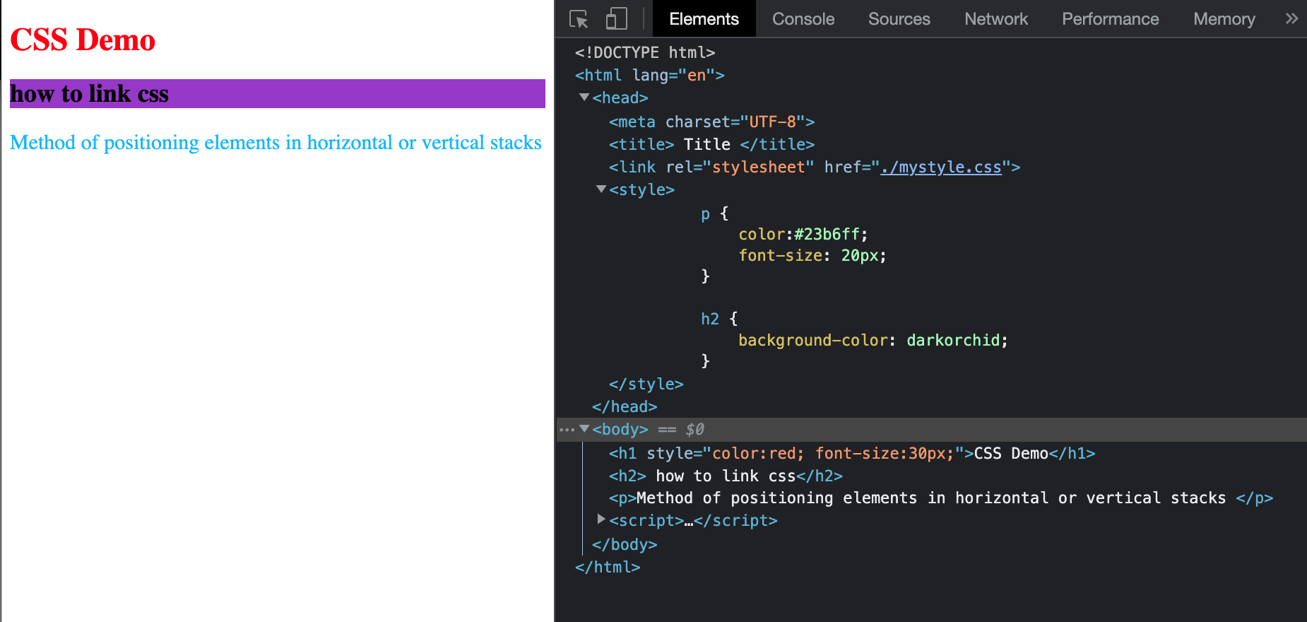
h2 {
background-color: darkorchid;
}
</style>
</head>
<body>
<h1 style = "color:red; font-size:30px;" >CSS Demo</h1>
<h2> how to link css</h2>
<p>Method of positioning elements in horizontal or vertical stacks </p>
<link rel = "stylesheet" href="./mystyle.css">
<!-- set h1 tag font color as red, using inline style -->
<h1 sytle = "color:red;"> I like web development</h1>
<!-- set p tag background color to blue, using internal style -->
<p style = "background-color:blue">I am a paragraph</p>
<!-- set span font size to 24px, using internal style-->
<span style ="font-size:24px;">I am a span</span>
</body>
</html>

https://jsbin.com/tarofazuyi/edit?html,output
2.3 CSS Comments
-
syntax
/* comments */ -
multiple comment lines
<!DOCTYPE html>
<html lang = 'en' >
<head>
    <meta charset = "UTF-8">
    <title> Title </title>

    <style>
        p {
            color:#23b6ff;
            font-size: 20px;
            /* comments */
        }

        h2 {
            background-color: darkorchid;
        }
            /* comment 1
            comment2
            comment3
            */
    </style>
    </head>
仅限于在css语句中 body中不可用
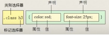
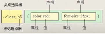
3. CSS Selectors
- all elements *
- element
- #id
- .class
- element element
- element, element
- element > element
The above are commonly used selectors, for more info please refer to link below
https://www.w3schools.com/cssref/css_selectors.asp
3.1 all elements *
selects all elements
<!DOCTYPE html>
<html lang = 'en' >
<head>
<meta charset = "UTF-8">
<title> Title </title>
<style>
p {
color:#23b6ff;
font-size: 20px;
background-color: darkorchid;
/* comments */
}
h2 {
background-color: darkorchid;
}
/* comment 1
comment2
comment3
*/
ul {
background-color: darkorchid;
}
</style>
</head>
<body>
<h1 style = "color:red; font-size:30px;" >CSS Demo</h1>
<h2> how to link css</h2>
<p>Method of positioning elements in horizontal or vertical stacks </p>
<!-- set h1 tag font color as red, using inline style -->
<h1 sytle = "color:red;"> I like web development</h1>
<!-- set p tag background color to blue, using internal style -->
<p style = "background-color:blue">I am a paragraph</p>
<!-- set span font size to 24px, using internal style-->
<span style ="font-size:24px;">I am a span</span>
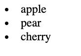
<ul>
<li>Apple</li>
<li>Pear</li>
<li>Cherry</li>
</ul>
</body>
</html>

<!DOCTYPE html>
<html lang = 'en' >
<head>
    <meta charset = "UTF-8">
    <title> Title </title>

    <style>
        * {
            background-color: darkorchid;
        }

        p {
            color:#23b6ff;
            font-size: 20px;
            /*background-color: darkorchid;*/
            /* comments */
        }

        h2 {
            /*background-color: darkorchid;*/
        }
            /* comment 1
            comment2
            comment3
            */
        ul {
            /*background-color: darkorchid;*/
        }
    </style>
    </head>
<body>
    <h1 style = "color:red; font-size:30px;" >CSS Demo</h1>
    <h2> how to link css</h2>
    <p>Method of positioning elements in horizontal or vertical stacks </p>


    <!-- set h1 tag font color as red, using inline style -->
    <h1 sytle = "color:red;"> I like web development</h1>

    <!-- set p tag background color to blue, using internal style -->
    <p style = "background-color:blue">I am a paragraph</p>

    <!-- set span font size to 24px, using internal style-->
    <span style ="font-size:24px;">I am a span</span>
    <ul>
        <li>Apple</li>
        <li>Pear</li>
        <li>Cherry</li>
    </ul>


</body>
</html>

3.2 element
- The element selector selects elements based on the element name.
e. g. p selects all <p> elements
3.3 #id
-
The id selector uses the id attribute of an HTML element to select a specific element.
-
The id of an element should be unique within a page, so the id selector is used to select one unique element!
-
To select an element with a specific id, write a hash (#) character, followed by the id of the element.
-
Must contain at least one character
-
Must not contain any space characters
e.g.#firstname - selects the element with id="firstname"
<!DOCTYPE html>
<html lang = 'en' >
<head>
    <meta charset = "UTF-8">
    <title> Title </title>

    <style>
        /** {*/
        /*  background-color: darkorchid;*/
        /*}*/

        p {
            color:#23b6ff;
            font-size: 20px;
            /*background-color: darkorchid;*/
            /* comments */
        }

        h2 {
            /*background-color: darkorchid;*/
        }
            /* comment 1
            comment2
            comment3
            */
        #apple {
            background-color: darkorchid;
        }
    </style>
    </head>
<body>
    <h1 style = "color:red; font-size:30px;" >CSS Demo</h1>
    <h2> how to link css</h2>
    <p>Method of positioning elements in horizontal or vertical stacks </p>


    <!-- set h1 tag font color as red, using inline style -->
    <h1 sytle = "color:red;"> I like web development</h1>

    <!-- set p tag background color to blue, using internal style -->
    <p style = "background-color:blue">I am a paragraph</p>

    <!-- set span font size to 24px, using internal style-->
    <span style ="font-size:24px;">I am a span</span>
    <ul>
        <li id="apple">Apple</li>
        <li>Pear</li>
        <li>Cherry</li>
    </ul>


</body>
</html>

3.4 .class
- The class selector selects elements with a specific class attribute.
- To select elements with a specific class, write a period
.character, followed by the name of the class.
e.g. .intro - selects all elements with class="intro"
<!DOCTYPE html>
<html lang = 'en' >
<head>
    <meta charset = "UTF-8">
    <title> Title </title>
    <style>
        #apple {
            background-color: darkorchid;
        }

        .common{
            font-size:30px;
        }
    </style>
    </head>
<body>
    <span style ="font-size:24px;">I am a span</span>
    <ul>
        <li id="apple" class = "common">Apple</li>
        <li class="common">Pear</li>
        <li>Cherry</li>
    </ul>

</body>
</html>

ID 是唯一的 class不是, ID的优先级高于class的优先级.
https://getbootstrap.com/docs/5.3/components/buttons/
css中一般用class来表示, id通常用于后端来注入的
<!DOCTYPE html>
<html lang = 'en' >
<head>
    <meta charset = "UTF-8">
    <title> Title </title>
    <style>
        #apple {
            background-color: darkorchid;
        }

        .common{
            font-size:30px;
        }

        .box {
            font-weight: bold;
        }

        .primary{
            background-color: aqua;
        }

        .success{
            background-color: green;
        }

        .warning{
            background-color: orange;
        }

        .danger{
            background-color: red;
        }
    </style>
    </head>
<body>
    <span style ="font-size:24px;">I am a span</span>
    <ul>
        <li id="apple" class = "common">Apple</li>
        <li class="common">Pear</li>
        <li>Cherry</li>
    </ul>

    <button class = "box primary">Primary</button>
    <button class = "box success">Success=</button>
    <button class = "box warning">Warning</button>
    <button class = "box danger">Danger</button>

</body>
</html>

Exercise 2: (homework)
<!--  h1 - set font to 30px**,* *font size to 30px-->
<!-- date - set font color to purple**,*  *font size to 24px -->
<!-- author - set font color to green**,*  *font size to 24px -->
<!-- news content - set font color to  blue**,*  *font size to 18px-->
<h1>Amazon  picks 20 finalists for its second headquarters</h1>
<p>by Kaya  Yurieff from cnn January 18, 2018: 10:44 AM ET </p>
<p>Amazon  has released a "short" list of cities it's considering for its  second headquarters.</p>
<p>The 20  potential cities are Atlanta; Austin; Boston; Chicago; Columbus, Ohio;  Dallas; Denver; Indianapolis; Los Angeles; Miami; Montgomery County,  Maryland; Nashville; Newark; New York City; Northern Virginia; Philadelphia;  Pittsburgh; Raleigh; Toronto and Washington, D.C.</p>
https://jsbin.com/vuvefuroye/edit?html,css
3.5 Combinator
A CSS selector can contain more than one simple selector
https://www.w3schools.com/css/css_combinators.asp
3.5.2 element element - “descendant selector(后代选择器)”
element element
The descendant selector matches all elements that are descendants of a specified element.
e.g. div p - selects all <p> elements inside <div> elements
https://www.w3schools.com/cssref/tryit.asp?filename=trycss_sel_element_element
3.5.3 element, element “(并集选择器)”
e.g. div, p - selects all <div> elements and all <p> elements
https://www.w3schools.com/cssref/tryit.asp?filename=trycss_sel_element_comma
3.5.4 element > element - “child selector(子元素选择器)”
The child selector selects all elements that are the immediate children of a specified element.
e.g. div > p - selects all <p> elements where the parent is a <div> element
https://www.w3schools.com/cssref/tryit.asp?filename=trycss_sel_element_gt
<!DOCTYPE html>
<html lang = 'en' >
<head>
   <meta charset = "UTF-8">
   <title> Title </title>
   </head>
   <style>
       div span{
           background-color: red;
       }

       div > span{
           font-size: 30px;
       }

       h1, h2{
           font-size: 30px;
       }
   </style>
<body>
   <h1>YES</h1>
   <h2>NO</h2>
   <div>
       <p>this is p and <span>span</span> tag</p>
   </div>

   <div>
       this is a <span>span</span> tag
   </div>

   <hr/>
   <span>another span</span>

</body>
</html>

More info:
https://css-tricks.com/specifics-on-css-specificity/
https://developer.mozilla.org/en-US/docs/Web/HTML/Element/link
4. Box Model
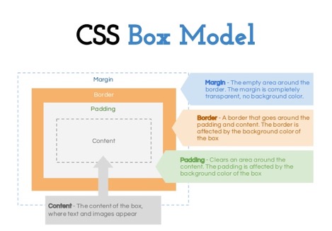
The CSS box model is essentially a box that wraps around every HTML element. It consists of: margins, borders, padding, and the actual content.
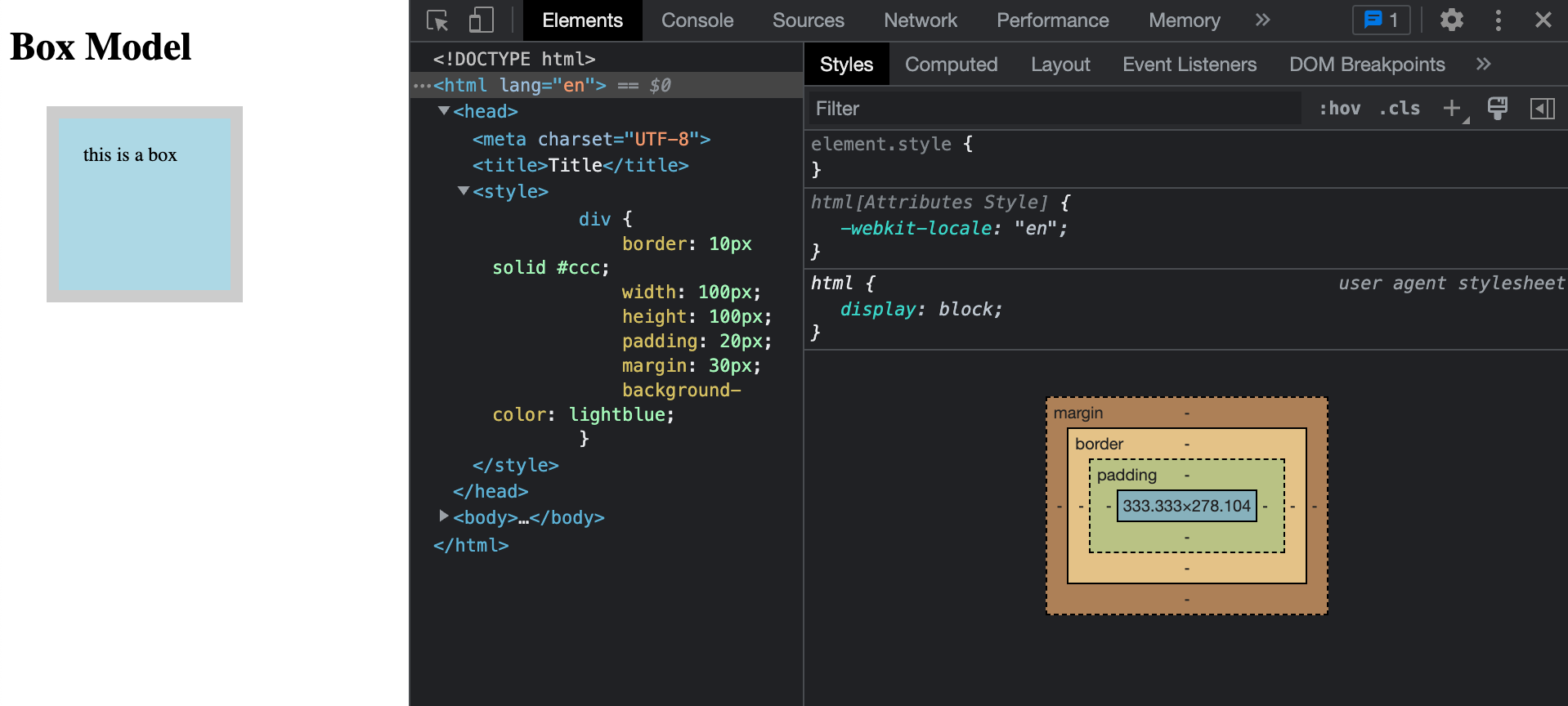
<!DOCTYPE html>
<html lang="en">
<head>
    <meta charset="UTF-8">
    <title>Title</title>
    <style>
        div {
            border: 10px solid #ccc;
            width: 100px;
            height: 100px;
            padding: 20px;
            margin: 30px;
            background-color: lightblue;
        }
    </style>

</head>
<body>
    <h1>Box Model</h1>
    <div>this is a box </div>
</body>
</html>
Explanation of the different parts:
● Content - The content of the box, where text and images appear
● Padding - Clears an area around the content. The padding is transparent
● Border - A border that goes around the padding and content
● Margin - Clears an area outside the border. The margin is transparent
Every element on a page is a rectangular box.
There are actually two types of box model, one is W3C standard, the other is IE model. Basically they all calculate the element width and height based on the content width, content height, padding and border, but their formula are different:
W3C standard
outer box (element space size)
Element space width = content width + padding + border + margin
Element space height = content height + padding + border + margin
inner box (element size)
Element width = content width + padding + border
Element height = content height + padding + border
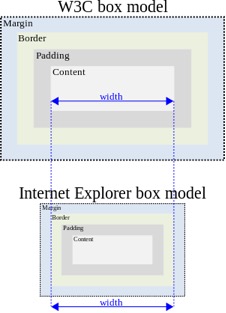
IE box model
outer box (element space size)
Element space width = content width + margin
Element space height = content height + margin
(content width including padding and border)
所给即所长, 不需要计算
In order to make sure we apply the same box model to all browsers, CSS3 provides us with the new box-sizing property:
box-sizing: content-box || border-box || inherit
<!DOCTYPE html>
<html lang = 'en' >
<head>
    <meta charset = "UTF-8">
    <title> Title </title>
    </head>
    <style>
        div span{
            background-color: red;
        }

        div > span{
            font-size: 30px;
        }

        h1, h2{
            font-size: 30px;
        }
    </style>
<body>
    <h1>YES</h1>
    <h2>NO</h2>
    <div>
        <p>this is p and <span>span</span> tag</p>
    </div>

    <div>
        this is a <span>span</span> tag
    </div>

    <hr/>
    <span>another span</span>

</body>
</html>
<!DOCTYPE html>
<html lang="en">
<head>
    <meta charset="UTF-8">
    <title>Title</title>
    <style>
        * {
            box-sizing: border-box;
        }
        /*div {*/
        /*    border: 10px solid #ccc;*/
        /*    width: 100px;*/
        /*    height: 100px;*/
        /*    padding: 20px;*/
        /*    margin: 30px;*/
        /*    background-color: lightblue;*/
        /*}*/

        .box {
            width: 100px;
            height: 100px;
            border: 1px solid #ccc;
            padding: 30px;    /*用padding 可以使小盒子居中*/
        }

        .box1 {
            width: 30px;
            height: 30px;
            background-color: lightblue;
        }
    </style>

</head>
<body>
    <h1>Box Model</h1>
    <div>this is a box </div>
    <div class="box">
        <div class="box1"></div>
    </div>
</body>
</html>

<!DOCTYPE html>
<html lang="en">
<head>
    <meta charset="UTF-8">
    <title>Title</title>
    <style>
        .box {
            width: 100px;
            height: 100px;
            border: 2px solid #ccc;

        }

    </style>

</head>
<body>
    <!--现在有两个盒子, 都有box的共同属性-->
    <div class = "box top"></div>
    <div class = "box bottom"></div>
</body>
</html>

<!DOCTYPE html>
<html lang="en">
<head>
    <meta charset="UTF-8">
    <title>Title</title>
    <style>
        .box {
            width: 100px;
            height: 100px;
            border: 2px solid #ccc;

        }

        .top{
            margin-bottom: 20px;
        }

        .bottom{
            margin-top: 30px;
        }
        /*两方块的中间的间隔会是top和bottom中的最大值, 而不是它们的和*/

    </style>

</head>
<body>
    <!--现在有两个盒子, 都有box的共同属性-->
    <div class = "box top"></div>
    <div class = "box bottom"></div>
</body>
</html>

5. Position
和float一样也是用在做布局的
static (default)
Default value, means the element is not positioned! A static element is said to be not positioned and an element with its position set to anything else is said to be positioned.
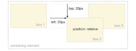
relative
The top, right, bottom and left properties of a relatively-positioned element will cause it to be adjusted away from its original position. Other content will not be adjusted to fit into any gap left by the element.
absolute
The top, right, bottom and left properties of an absolute-positioned element will cause it to be positioned relatively to the nearest positioned ancestor.
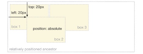
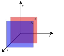
通常会用父元素relative, 子元素用absolute, 比如要移动某个块, 便于一起移动.
absolute原来图片上 又多加了一层图层
<!DOCTYPE html>
<html lang="en">
<head>
    <meta charset="UTF-8">
    <title>position</title>
    <style>
      .rl {
        width: 200px;
        height: 200px;
        border: 1px solid lightblue;

        position: relative;
        top: 10px;
        left: 20px;
        /*相对于它原来位置定位*/
        /* relative: offset -> top bottom left right*/
        /* original position */
      }

      .common {
        width: 100px;
        height: 100px;
        background-color: #cccccc;
      }

      .ab {
          width: 200px;
          height: 200px;
          background-color: lightblue;

          position: absolute;
          top:20px;
          left: 200px;
          /* absolute 通常是以你的可视窗口 即top,left等来定位的*/

      }
      .box1 {
          width: 400px;
          height: 300px;
          background-color: lightpink;
          margin: 50px auto;
          position: relative;

      }

      .box2 {
          width: 200px;
          height: 200px;
          background-color: lightblue;
          margin-left: 50px;
      }

      .box3{
          width: 30px;
          height: 30px;
          background-color: lightgreen;
          margin-left:30px;
          position: absolute;
          top: 20px;
          /* absolute 它会找定位元素, 发现box2不是继续向上查找,发现box1是. */
          /* 定位元素 可以是position 或 absolute, 若没有定位元素则用窗口来定位*/
      }
    </style>
</head>
<body>
    <h1>Positioning & Z-index</h1>
    <div class = "box1">
        <div class = "box2">
            <div class = "box3"></div>
        </div>
    </div>


<!--    <div class ="rl">-->
<!--      this is a div - relative position-->
<!--    </div>-->

<!--    <div class = "common"> </div>-->

<!--    <div class = "ab">-->
<!--      this is a div - absolute-->
<!--    </div>-->

<!--    <p>this is paragraph </p>-->
</body>
</html>

position 会对于元素块, 而float则是相当于多了个图层.
fixed
fix是相对于窗口怎么定位的
A fixed element is positioned relative to the viewport, which means it always stays in the same place even if the page is scrolled.
<!DOCTYPE html>
<html lang="en">
<head>
    <meta charset="UTF-8">
    <title>Relative Position</title>
    <style>
          body, div{
            padding: 0;
            margin: 0;
          }

          div {
            border: 1px solid blue;
          }

          .rl{
              width: 200px;
              height: 200px;

              /*step 1 相对定位*/
              /* 设置了相对定位之后,容器的css就可以设置left, right,top, bottom属性 */
              position: relative;
              /* 相对于元素原来的位置 */
              left: 10px;
              top: 20px;
          }
          /* step 2 绝对定位 */
          .ab {
              width: 200px;
              height: 100px;
              background-color: lightpink;

              /*step 2.1*/
              position: absolute;;
              top: 30px;
              left: 100px;

              /*position: relative; */
              /*top: 30px; */
              /*left: 100px;*/

          }

          /*step 3 设置父容器定位 */
          .parent {
              width: 400px;
              height: 500px;
              background-color: lightgray;

              /*step 4 加上定位 */
              position: relative;
          }

          /*step 5 fix position*/
          .f{
              position: fixed;
              top: 0;
              right: 0;
              height: 100px;
              width: 100px;
              background-color: lavender;
          }

    </style>
</head>
<body>
    <!-- step 1 相对定位-->
    <div class="rl">
        this is a div - relative position
    </div>

    <!--step 2 绝对定位-->
    <div class="ab">
        this is a div - absolute position
    </div>

    <!--step 3 设置父容器定位 comment掉上面的ab-->
    <div class="parent">
        <div class="ab">
            this is a div - absolute position
        </div>
    </div>

    <!--step 5 fix position-->
    <div class="f">
        fix position
    </div>
</body>
</html>

<!DOCTYPE html>
<html lang="en">
<head>
    <meta charset="UTF-8">
    <title>position</title>
    <style>
        .f {
            margin: 100px;
            width: 100px;
            background-color: #23b6ff;

            position: fixed; /*在你上下移动窗口 滚动页面的时候 它永远随着滚动 固定那个位置*/
            top: 0;
            right: 0;
            /*适用于做网页的小广告*/
        }

    </style>
</head>
<body>
    <div class = "f">
        fix position
    </div>
    <br><br><br><br><br><br><br><br><br><br><br><br><br><br><br><br><br><br><br><br><br><br><br><br>
    <br><br><br><br><br><br><br><br><br><br><br><br><br><br><br><br><br><br><br><br><br><br><br><br>
    <p> this is a p </p>
</body>
</html>


More readings:
http://learnlayout.com/position-example.html
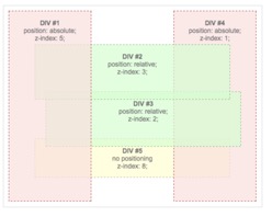
6. Z-index
The z-index property specifies the stack order of an element.
An element with greater stack order is always in front of an element with a lower stack order.
Note: z-index only works on positioned elements (position:absolute, position:relative, or position:fixed).
<!DOCTYPE html>
<html lang="en">
<head>
    <meta charset="UTF-8">
    <title>Title</title>
    <style>
      .ab {
        position: absolute;
        height: 200px;
        width: 200px;
        border: 1px solid lightblue;
      }

      .d1 {
        /*middle*/
        z-index: 100;
        left: 100px;
        top: 100px;
        background-color: lightblue;
      }

      .d2 {
        /*top*/
        z-index: 200;
        background-color: lightpink;
      }

      .d3 {
        /*bottom*/
        z-index: 4;
        left: 20px;
        top: -30px;
        background-color: lightgreen;
      }
    </style>
</head>
<body>
    <div class="ab d1"> middle </div>
    <div class="ab d2"> top </div>
    <div class="ab d3"> button </div>

</body>
</html>

z-index是用来控制图层的. 值越大就在上
7. FlexBox
Flexbox is a one-dimensional layout method for laying out items in rows or columns. Let’s take a look at the link below together.
https://css-tricks.com/snippets/css/a-guide-to-flexbox/
8. 浮动
<!DOCTYPE html>
<html lang="en">
<head>
    <meta charset="UTF-8">
    <title>Title</title>
    <style>
        img {
            width: 200px;
            /*浮动属性 float 来解决图片和文字的布局问题*/
            /*float: left;*/
        }
    </style>

</head>
<body>
    <img src = "https://p4-ofp.static.pub/fes/cms/2021/07/22/wx26nul35lqpebefp6gwz1kgzwvwsf781925.png" alt="">
    <span> They are very good. Built to perform and engineered to endure,
        our flagship laptops have you covered in the office, out in the field,
        and everywhere in between. Productivity-rich features like epic battery life,
        blazing-fast USB –C Thunderbolt® ports, and powerful processing keep you up and running.</span>
</body>
</html>

加了float
<!DOCTYPE html>
<html lang="en">
<head>
    <meta charset="UTF-8">
    <title>Title</title>
    <style>
        img {
            width: 200px;
            /*浮动属性 float 来解决图片和文字的布局问题*/
            float: left;
        }
    </style>

</head>
<body>
    <img src = "https://p4-ofp.static.pub/fes/cms/2021/07/22/wx26nul35lqpebefp6gwz1kgzwvwsf781925.png" alt="">
    <span> They are very good. Built to perform and engineered to endure,
        our flagship laptops have you covered in the office, out in the field,
        and everywhere in between. Productivity-rich features like epic battery life,
        blazing-fast USB –C Thunderbolt® ports, and powerful processing keep you up and running.</span>
</body>
</html>

<!DOCTYPE html>
<html lang="en">
<head>
    <meta charset="UTF-8">
    <title>Title</title>
    <style>
        .al {
            border: 1px solid #ccc;
            background-color: lightblue;
        }
    </style>

</head>
<body>
    <div class="al">
        this is a demo on float
    </div>
</body>
</html>

加float使其向右浮动
<!DOCTYPE html>
<html lang="en">
<head>
    <meta charset="UTF-8">
    <title>Title</title>
    <style>
        .al {
            border: 1px solid #ccc;
            background-color: lightblue;

            float: right;
        }
    </style>

</head>
<body>
    <div class="al">
        this is a demo on float
    </div>
</body>
</html>

<!DOCTYPE html>
<html lang="en">
<head>
    <meta charset="UTF-8">
    <title>Title</title>
    <style>
        .box1 {
            width: 100px;
            height: 100px;
            background-color: lightblue;
        }
        .box2{
            width: 200px;
            height: 200px;
            background-color: lightpink;
        }
    </style>

</head>
<body>
    <div class="box1"></div>
    <div class="box2"></div>
</body>
</html>

<!DOCTYPE html>
<html lang="en">
<head>
    <meta charset="UTF-8">
    <title>Title</title>
    <style>
        .box1 {
            width: 100px;
            height: 100px;
            background-color: lightblue;

            float: left;
        }
        .box2{
            width: 200px;
            height: 200px;
            background-color: lightpink;
        }
    </style>

</head>
<body>
    <div class="box1"></div>
    <div class="box2"></div>

    <!-- span inline 元素 -->
    <div class="box1"></div>
    <span>1234567</span>
    <!-- inline 和 纯文本 都能识别浮动元素的位置 -->
</body>
</html>

若让两个都浮动起来
<!DOCTYPE html>
<html lang="en">
<head>
    <meta charset="UTF-8">
    <title>Title</title>
    <style>
        .box1 {
            width: 100px;
            height: 100px;
            background-color: lightblue;

            float: left;
        }
        .box2{
            width: 200px;
            height: 200px;
            background-color: lightpink;

            float: left;
        }
    </style>

</head>
<body>
    <div class="box1"></div>
    <div class="box2"></div>

    <!-- span inline 元素 -->

    <span>1234567</span>
    <!-- inline 和 纯文本 都能识别浮动元素的位置 -->
</body>

float可以用来布局
<!DOCTYPE html>
<html lang="en">
<head>
<meta charset="UTF-8">
<title>Title</title>
<style>
/*li {*/
/* float: left;*/
/* margin-left: 20px;*/
/*}*/
</style>
</head>
<body>
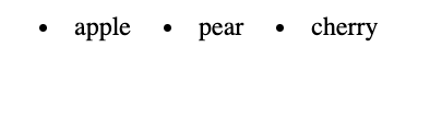
<li>apple</li>
<li>pear</li>
<li>cherry</li>
</body>
</html>
<!DOCTYPE html>
<html lang="en">
<head>
    <meta charset="UTF-8">
    <title>Title</title>
    <style>
        li {
            float: left;
            margin-left: 20px;
        }
    </style>

</head>
<body>
    <li>apple</li>
    <li>pear</li>
    <li>cherry</li>
</body>
</html>
<!DOCTYPE html>
<html lang="en">
<head>
    <meta charset="UTF-8">
    <title>Title</title>
    <style>
        .box1 {
            width: 100px;
            height: 100px;
            background-color: lightblue;
            float:left

        }
        .box2{
            width: 200px;
            height: 200px;
            background-color: lightpink;
            float: left;
        }

        li {
            float: left;
            margin-left: 20px;
        }

        /*.clear{*/
        /*    clear: left;*/
        /*}*/
    </style>

</head>

<body>
    <div class="box1"></div>
    <div class="box2"></div>
<!--    <div class = "clear"></div>-->
    <ul>
        <li>apple</li>
        <li>pear</li>
        <li>cherry</li>
    </ul>
</body>
</html>

清除之前的浮动
<!DOCTYPE html>
<html lang="en">
<head>
    <meta charset="UTF-8">
    <title>Title</title>
    <style>
        .box1 {
            width: 100px;
            height: 100px;
            background-color: lightblue;
            float:left

        }
        .box2{
            width: 200px;
            height: 200px;
            background-color: lightpink;
            float: left;
        }

        li {
            float: left;
            margin-left: 20px;
        }

        .clear{
            clear: left;
        }
    </style>

</head>

<body>
    <div class="box1"></div>
    <div class="box2"></div>
    <div class = "clear"></div>
    <ul>
        <li>apple</li>
        <li>pear</li>
        <li>cherry</li>
    </ul>
</body>
</html>

上左右
网站最经常的,基础的布局
<!DOCTYPE html>
<html lang="en">
<head>
    <meta charset="UTF-8">
    <title>Title</title>
    <style>
        .main {
            width: 400px;
            height: 400px;
            background-color: #cccccc;
            color: red;
        }

        .left{
            width: 100px;
            height: 100px;
            background-color: #23b6ff;
            float: left;

        }

        .right {
            width: 100px;
            height: 100px;
            background-color: #DB6E3F;
            float: left;

        }
        .clear  {
            clear:left;
        }
    </style>

</head>

<body>
    <div>header</div>
    <div class="main">
        <div class = "left"></div>
        <div class = "right"></div>
        <div class = "clear"></div>
        123
    </div>

</body>
</html>

CSS样式
之前我们编写的页面非常基础,我们只能通过一些很基本的属性来排列我们的页面元素,那么如何实现更高度的自定义呢,我们就需要用到CSS来自定义样式,首先我们创建一个名为style.css的文件。
首先在我们HTML文件的头部添加:
我们在CSS文件中添加以下内容:
我们发现,网页的内容全部变为居中显示了,这正是css在生效,相当于我们现在给页面添加了自定义的样式规则。
当然,我们也可以选择不使用CSS,而是直接对某个元素添加样式:
这样的效果其实是等同于上面的css文件的,相当于我们直接把样式定义在指定元素上。
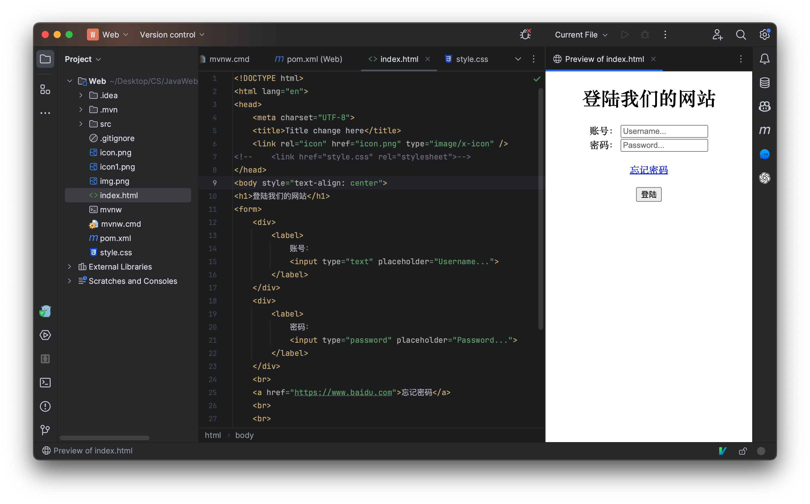
也可以在头部直接定义样式,而不是使用外部文件:
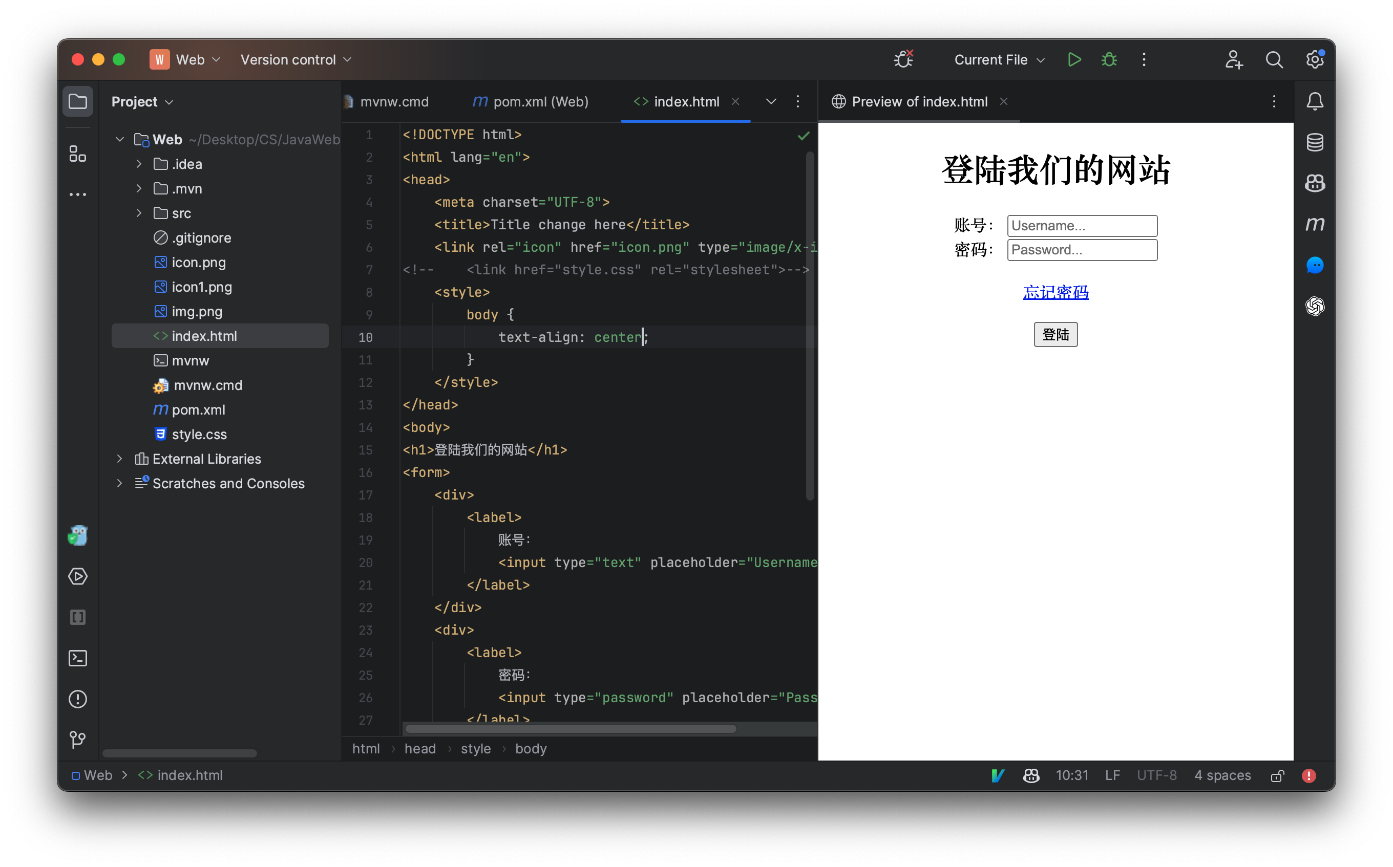
使用以上三种方式都可以自定义页面的样式,我们推荐使用还是第一种,不然我们的代码会很繁杂。
样式的属性是非常多的,我们不可能一个一个全部讲完,视频中用到什么再来讲解什么,如果同学们感兴趣,可以自行下去了解。
CSS选择器
我们首先来了解一下选择器,那么什么是选择器呢?我们想要自定义一个元素的样式,那么我们肯定要去选择某个元素,只有先找到要自定义的元素,我们才能开始编写样式。
我们上面的例子中使用的就是标签名选择器,它可以快速选择页面中所有指定的的标签,比如我们之前使用的就是body标签,那么就相当于页面中所有的body元素全都使用此样式,那么我们现在来试试看选择页面中所有的input标签:
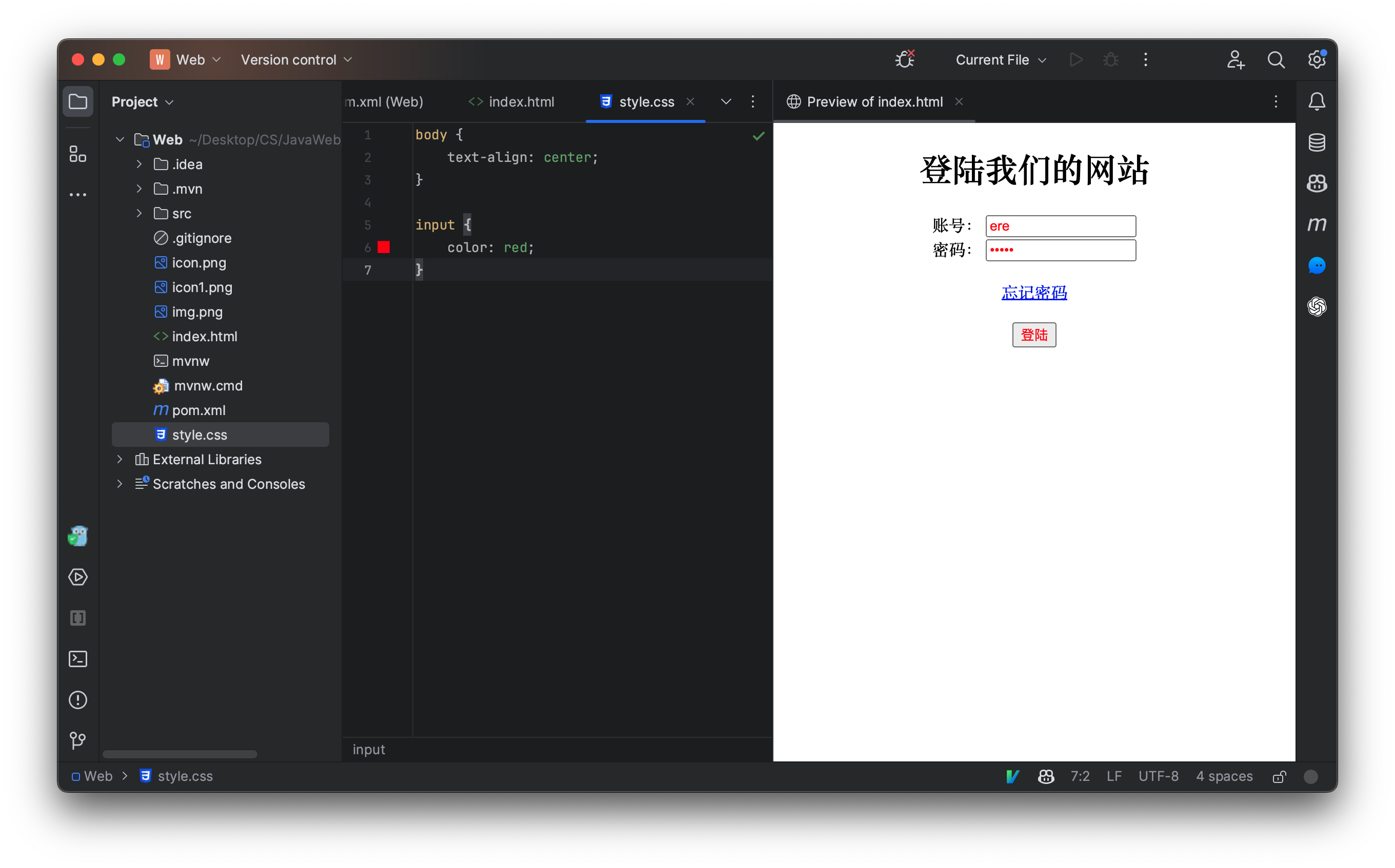
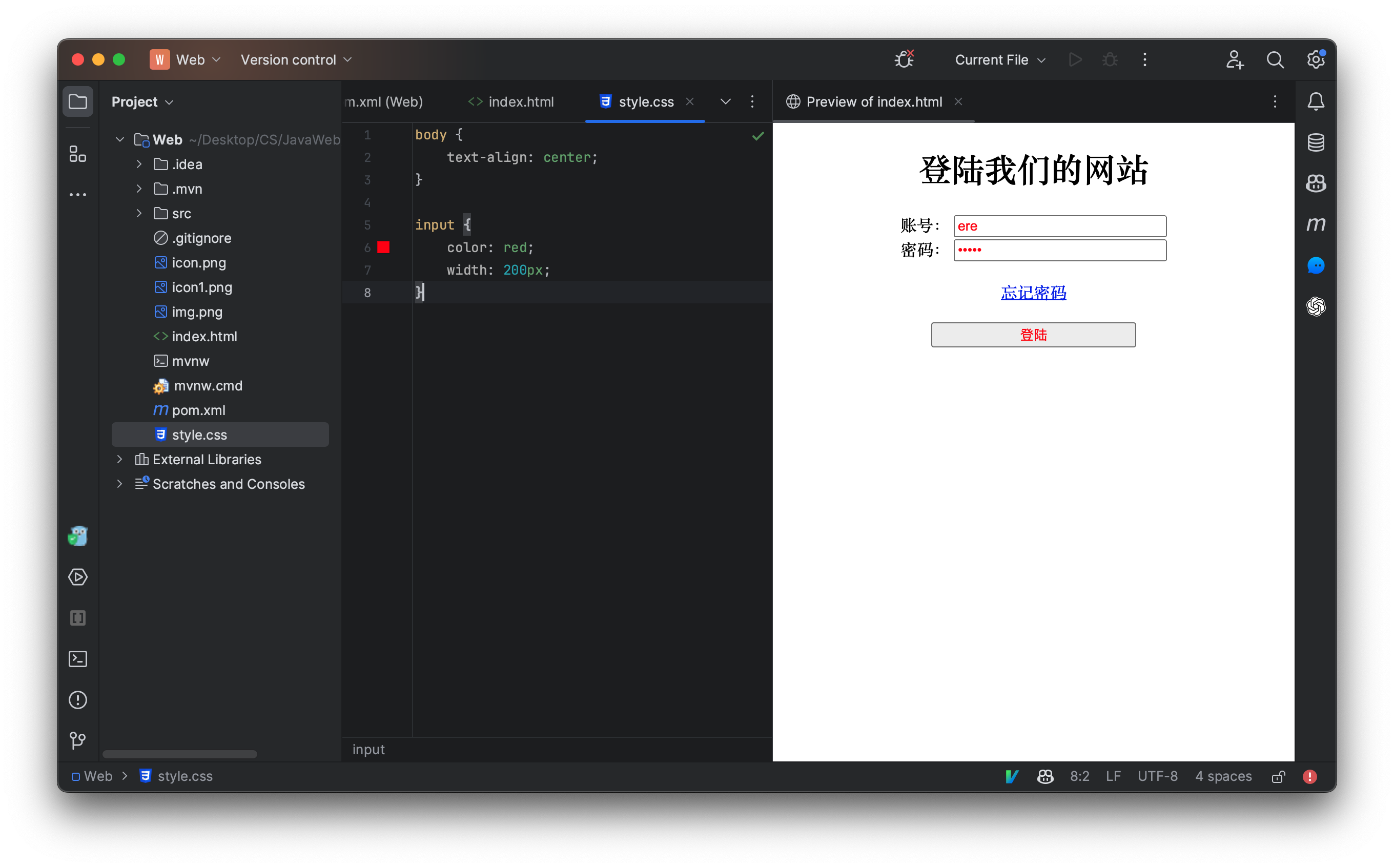
我们发现,页面中所有的input元素宽度全部被设定为了200个像素(px是单位大小,代表像素,除了px还有em和rem,他们是根据当前元素字体大小决定的相对大小,一般用于适配各种大小的浏览器窗口,这里暂时不用)
样式编写完成后,如果只有一个属性,可以不带;若多个属性则每个属性后面都需要添加一个;
因此,一个标签选择器的格式为:
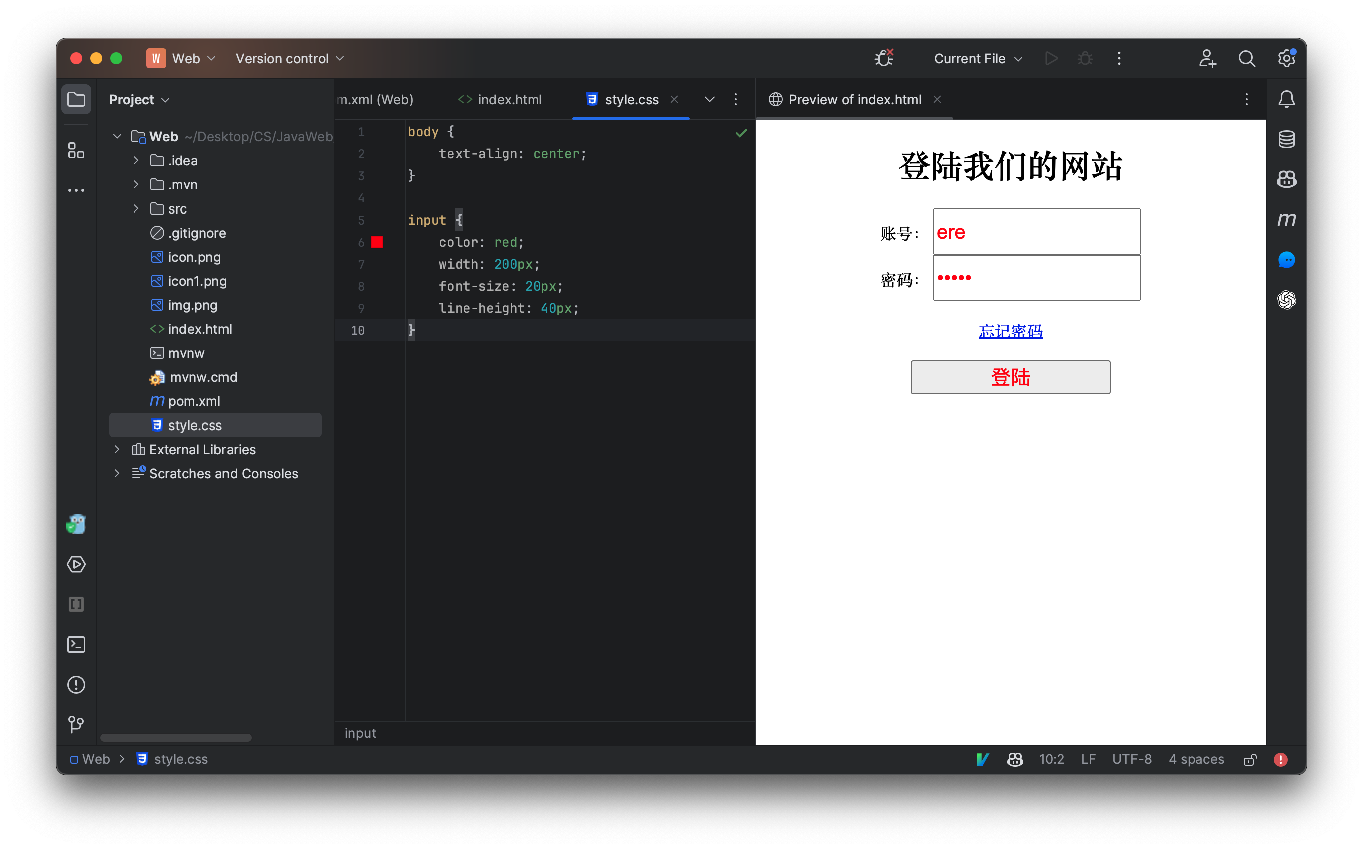
我们还可以设定输入框的字体大小、行高等:
我们现在可以通过选择器快速地去设置某个元素样式了,那么如何实现只设置某个元素的样式呢,现在我们来看看,id选择器,我们之前已经讲解过了,每个元素都可以有一个id属性,我们可以将其当做一个跳转的锚点使用,而现在,我们可以使用css来进行定位:
我们先为元素添加id属性:
现在使用CSS选择我们的元素,并设定一个属性,选择某个id需要在前面加上一个#:
虽然id选择器已经可以很方便的指定某个元素,但是如果我们希望n个但不是元素都被选择,id选择器就无法实现了,因为每个元素的id是唯一的,不允许出现重复id的元素,因此接着我们来讲解一下类选择器。
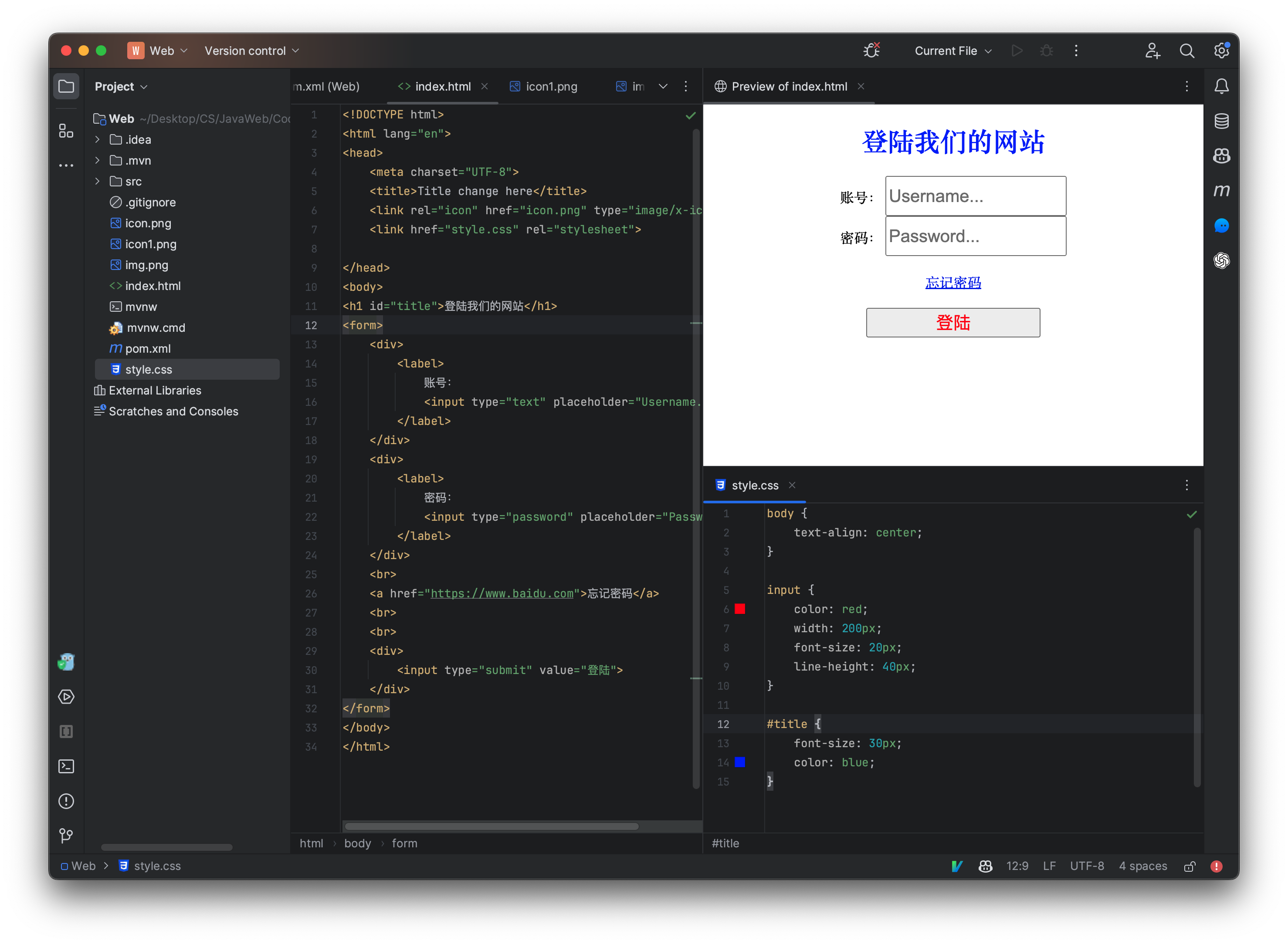
每个元素都可以有一个class属性,表示当前元素属于某个类(注意这里的类和我们Java中的类概念完全不同)一个元素可以属于很多个类,一个类也可以被很多个元素使用:
<form>
    <div >
        <label class="test">
            账号:
            <input type="text" placeholder="Username...">
        </label>
    </div>
    <div>
        <label class="test">
            密码:
            <input type="password" placeholder="Password...">
        </label>
    </div>
</form>
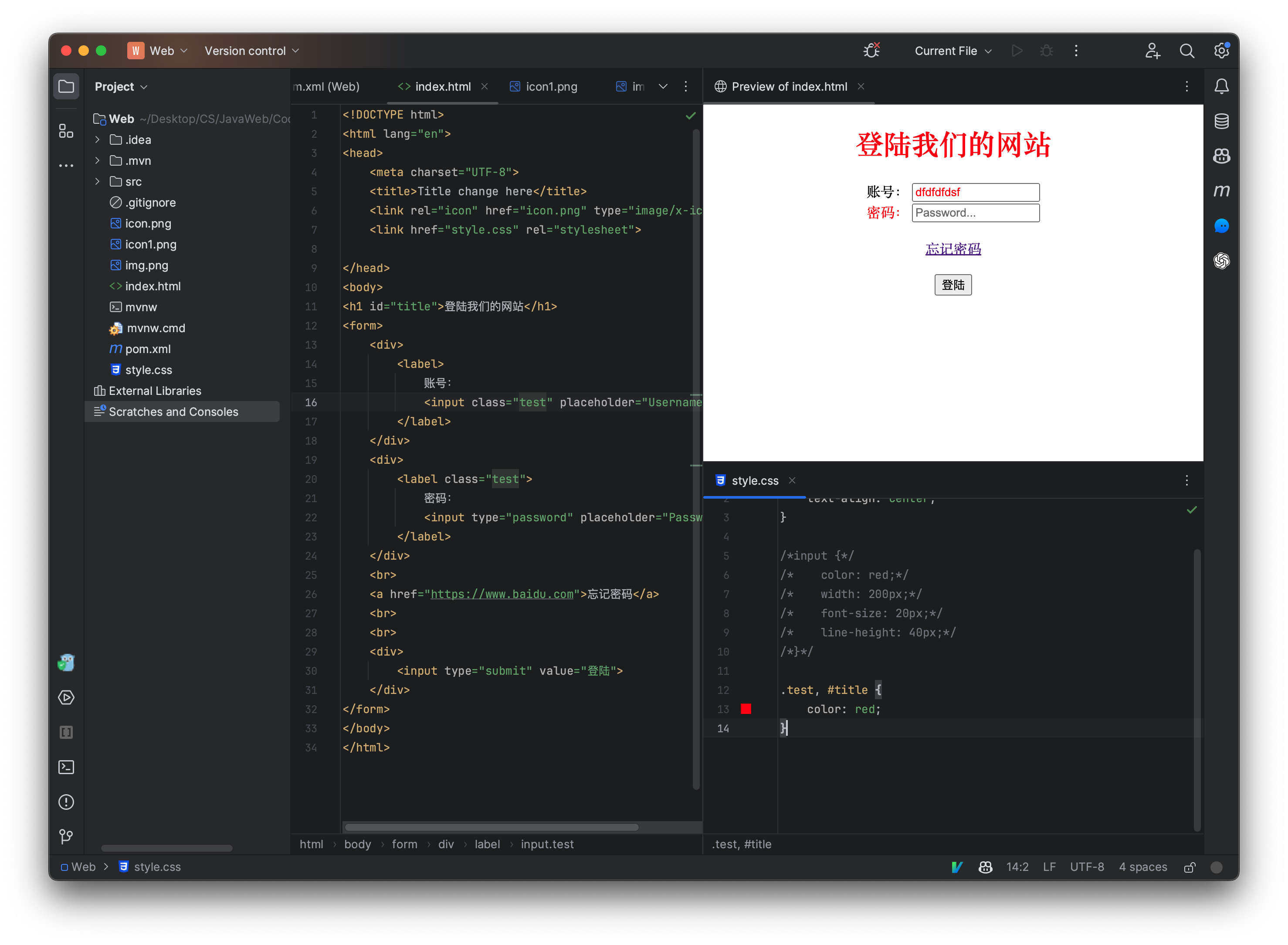
上面的例子中,两个label元素都使用了test类(类名称是我们自定义的),现在我们在css文件中编写以下内容来以类进行选择:
``` css .test{ color: blue; }
我们发现,两个标签的文本内容都变为了蓝色,因此使用类选择器,能够对所有为此类的元素添加样式。注意在进行类选择时,我们需要在类名前面加上`.`来表示。


我们发现,两个标签的文本内容都变为了蓝色,因此使用类选择器,能够对所有为此类的元素添加样式。注意在进行类选择时,我们需要在类名前面加上`.`来表示。
### 组合选择器和优先级问题
我们也可以让多个选择器,共用一个css样式:
```css
.test, #title {
color: red;
}
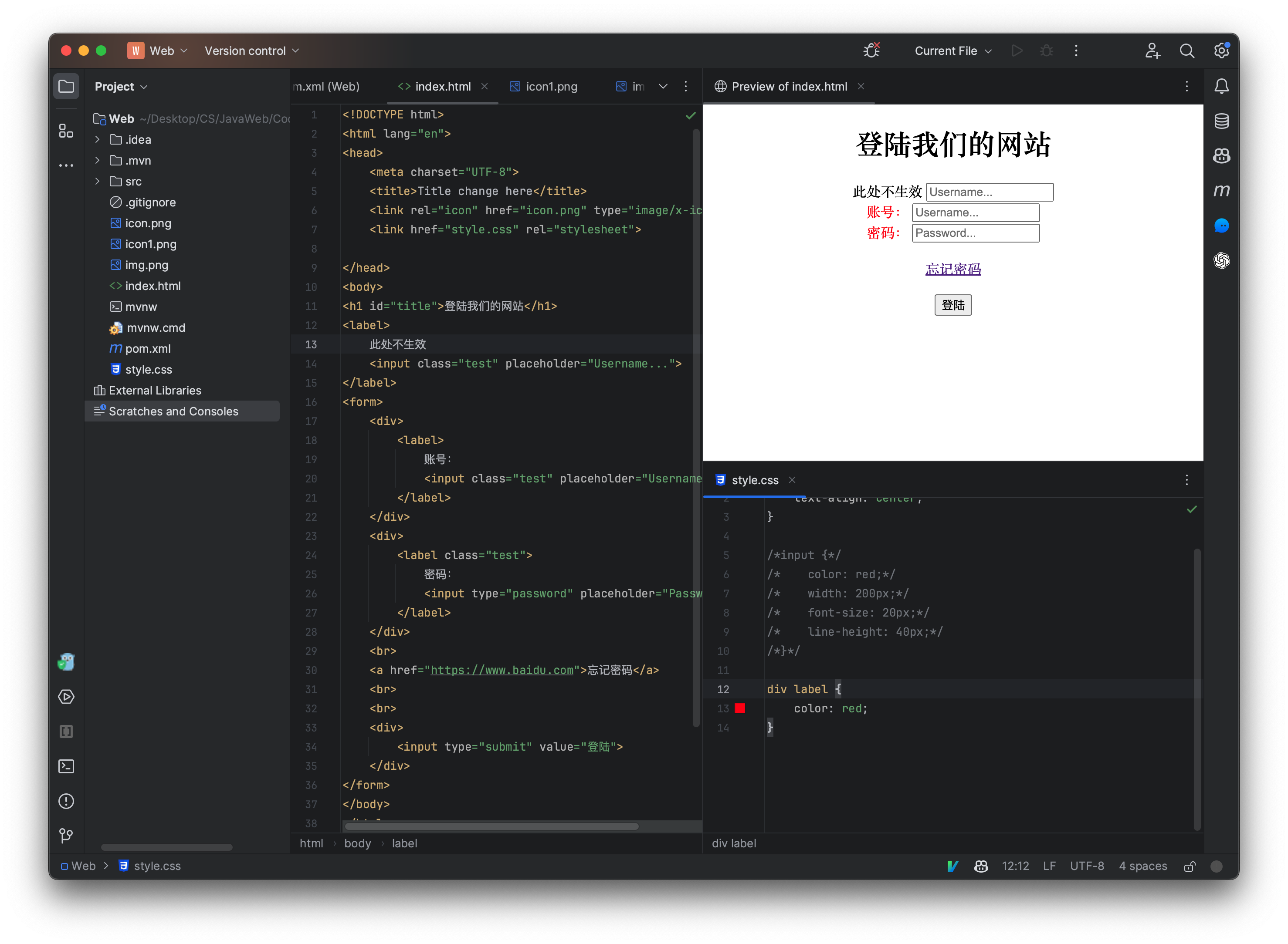
只需要并排写即可,注意中间需要添加一个英文的逗号用于分割,我们也可以使用*来一次性选择所有的元素:

我们还可以选择位于某个元素内的某个元素:
这样的话,就会选择所有位于div元素中的label元素。
当然,我们这里只介绍了一些常用的选择器,有关详细的CSS选择器可以查阅:https://www.runoob.com/cssref/css-selectors.html
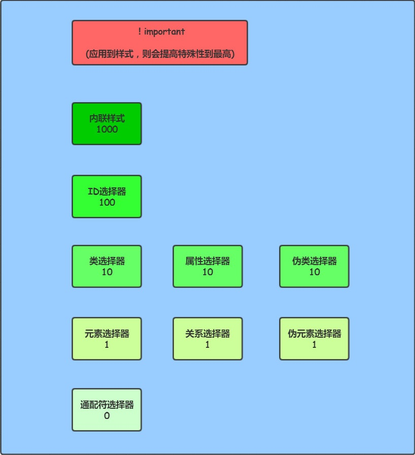
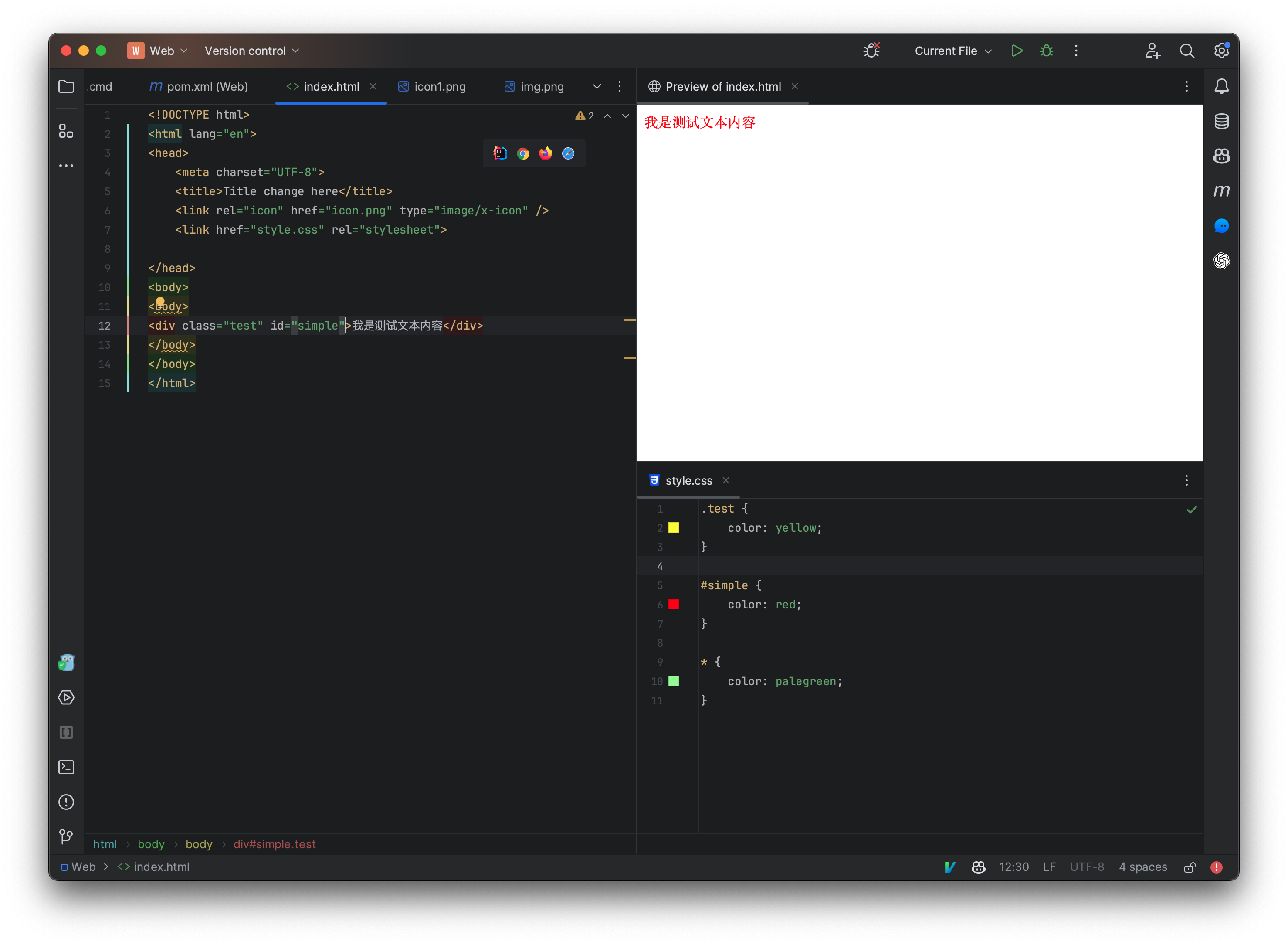
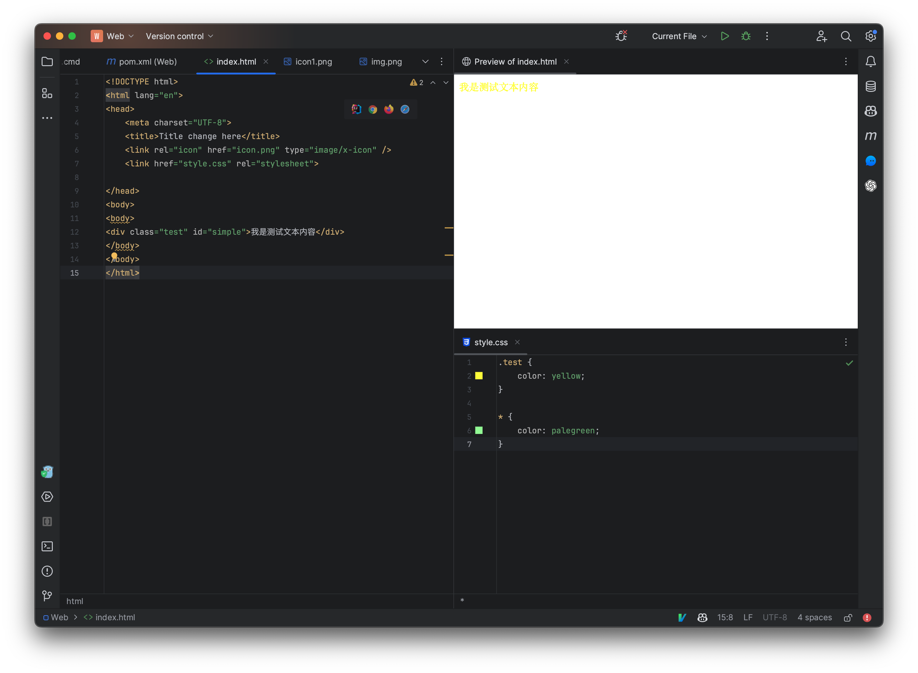
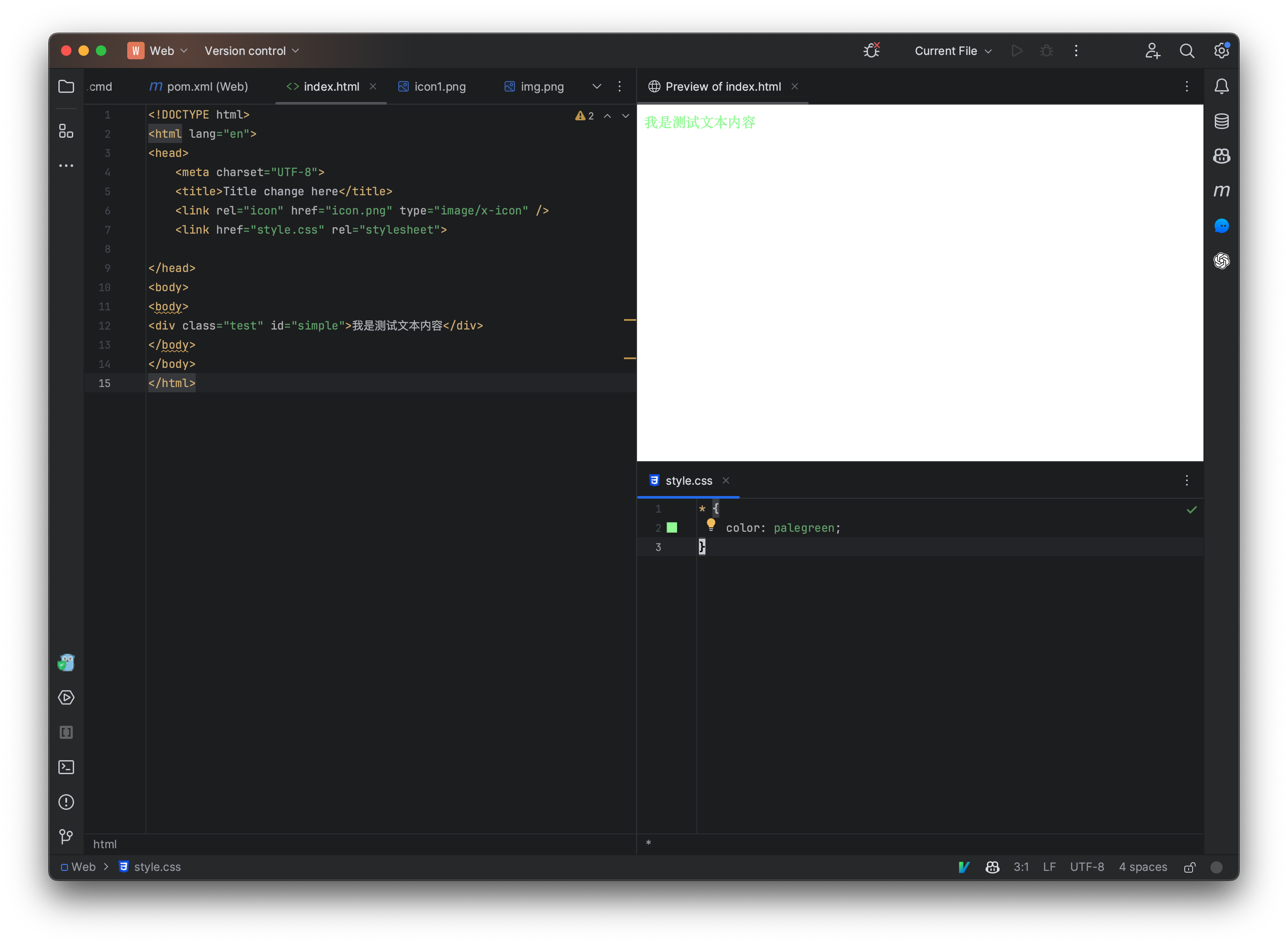
我们接着来看一下选择器的优先级:
我们根据上面的信息,来测试一下,首先编写一下HTML文件:
现在我们来编写一下css文件:
那么现在我们可以看到,实际上生效的是我们直接编写在标签内部的内联属性,那么现在我们依次进行移除,来看看它们的优先级。
那么如果我们希望某个属性无视任何的优先级,我们可以在属性后面添加!important标记,表示此属性是一个重要属性,它的优先级会被置为最高。
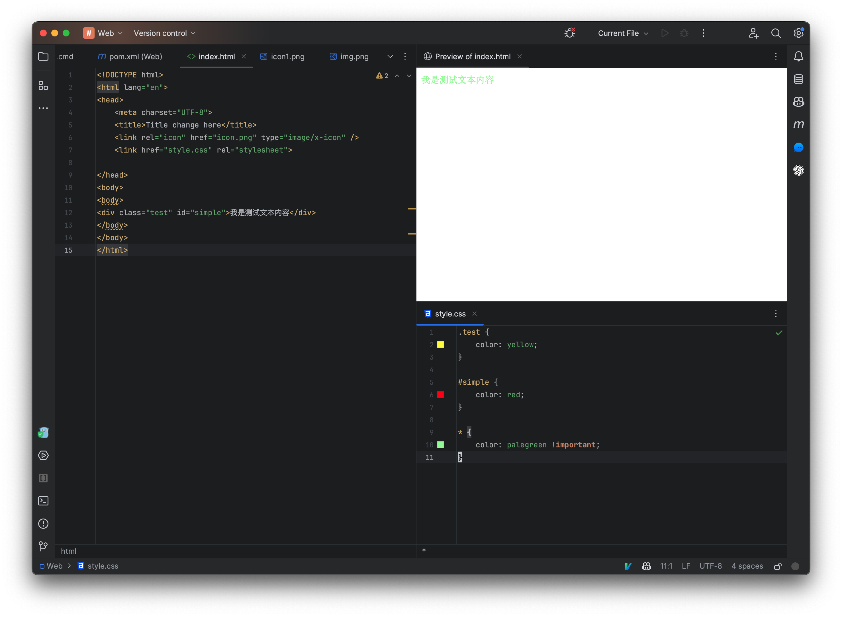
思考:那要是我每个选择器的这个属性后面都加一个!important会怎么样?
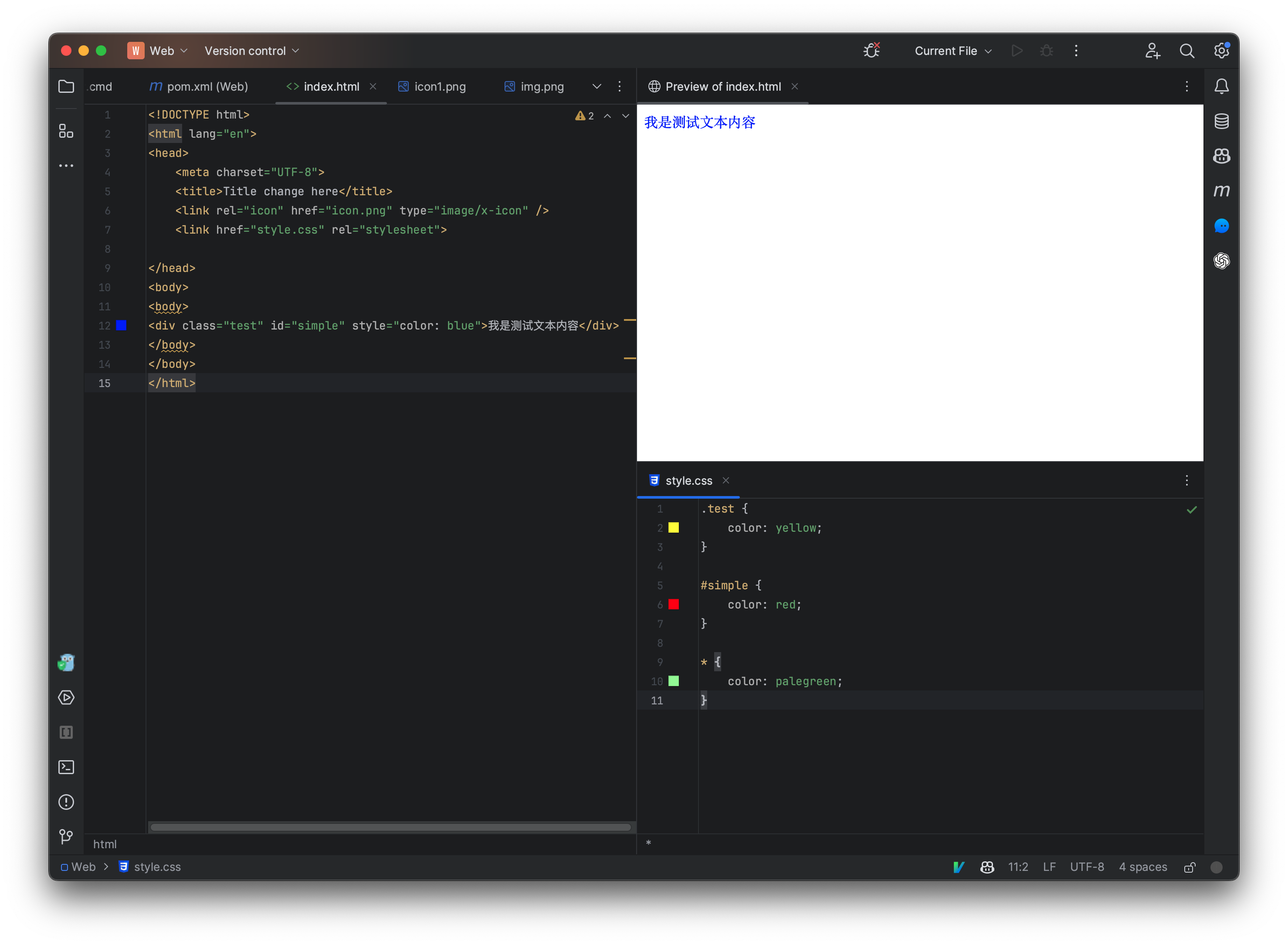
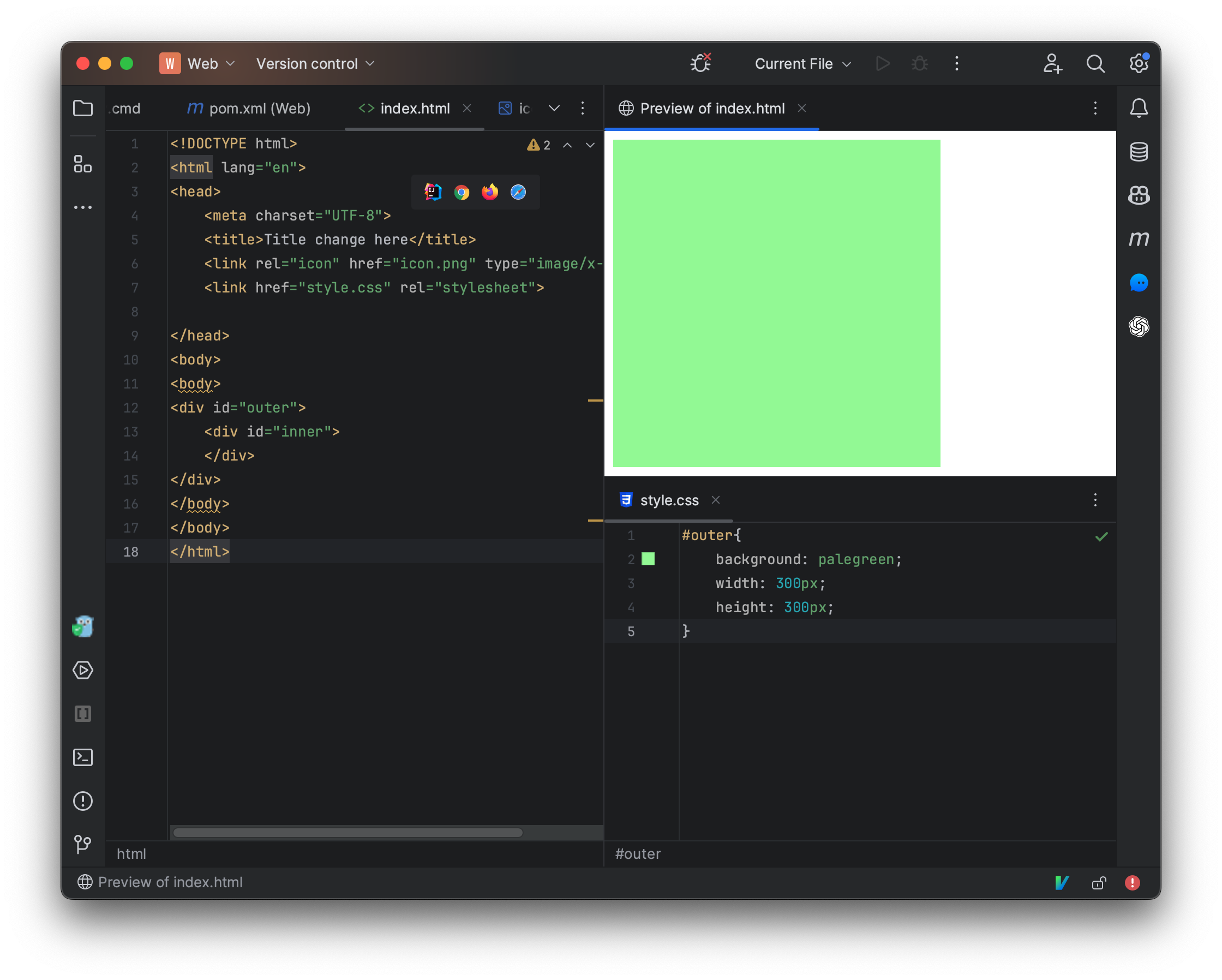
自定义边距
我们来看看,如何使用css控制一个div板块的样式,首先编写以下代码,相当于一个div嵌套了一个div元素:
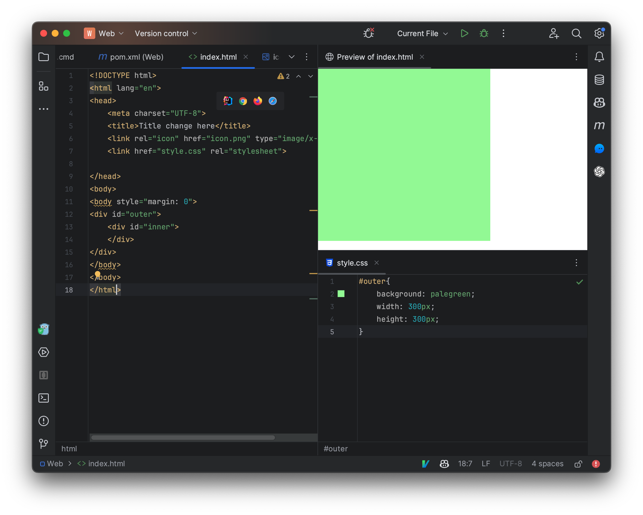
现在编写一下自定义的css样式,我们将div设定为固定大小,并且背景颜色添加为绿色:
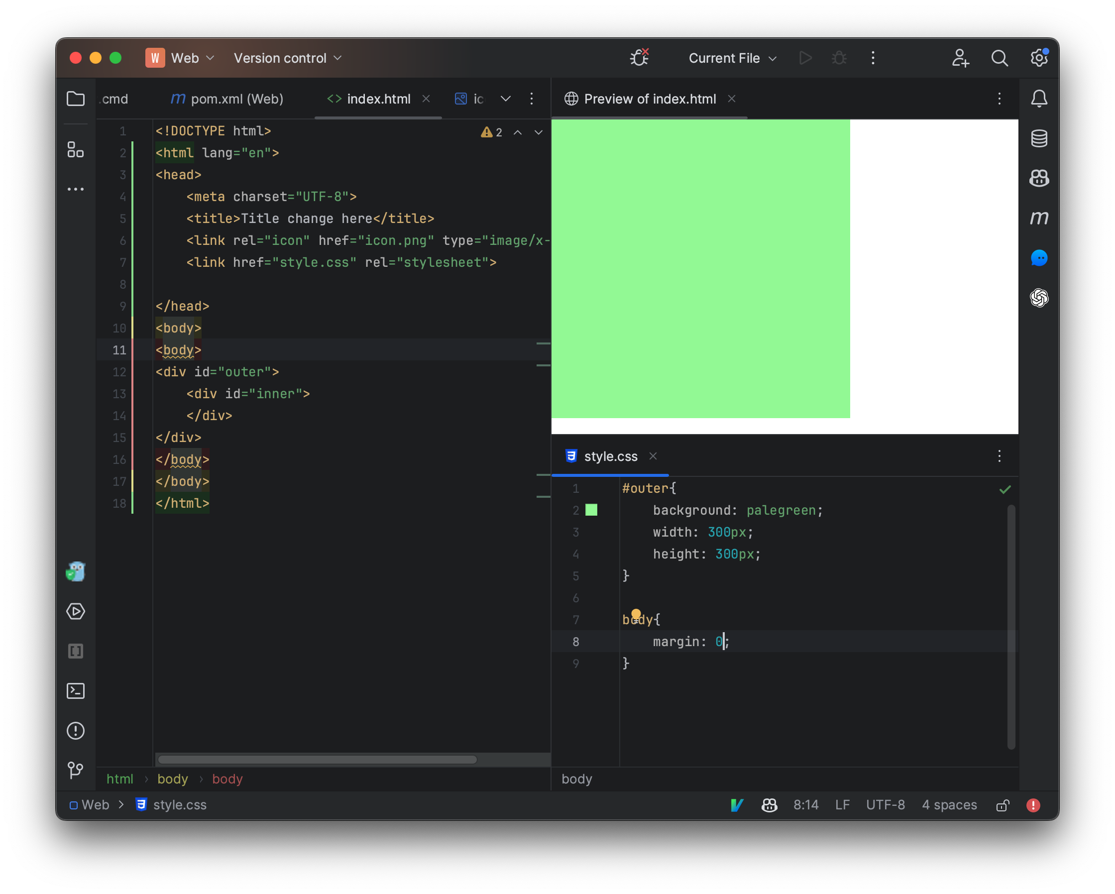
我们发现左侧快速预览页面存在空隙,这是因为浏览器给我们添加了一个边距属性,我们只需要覆盖此属性并将其设定为0即可:
现在我们给内部嵌套的div也设定一个大小,并将颜色设定为橙色:
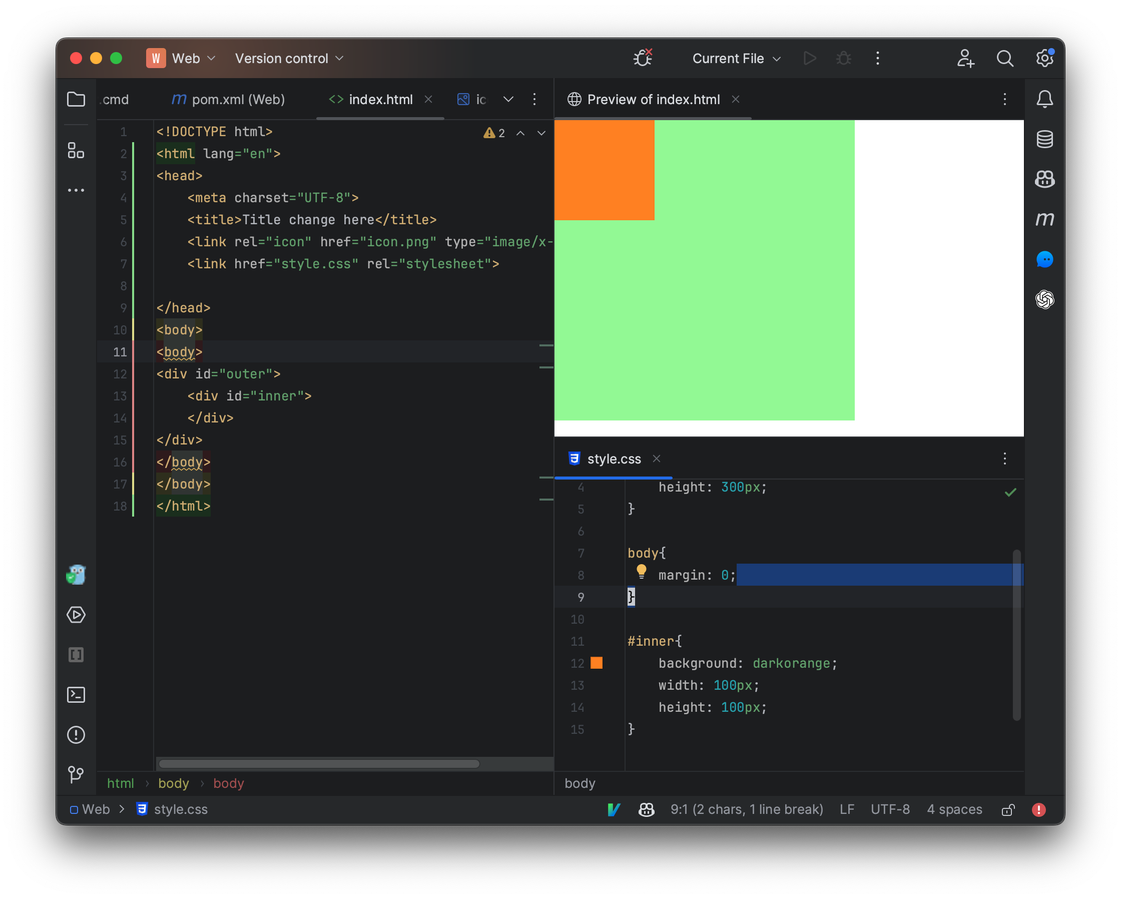
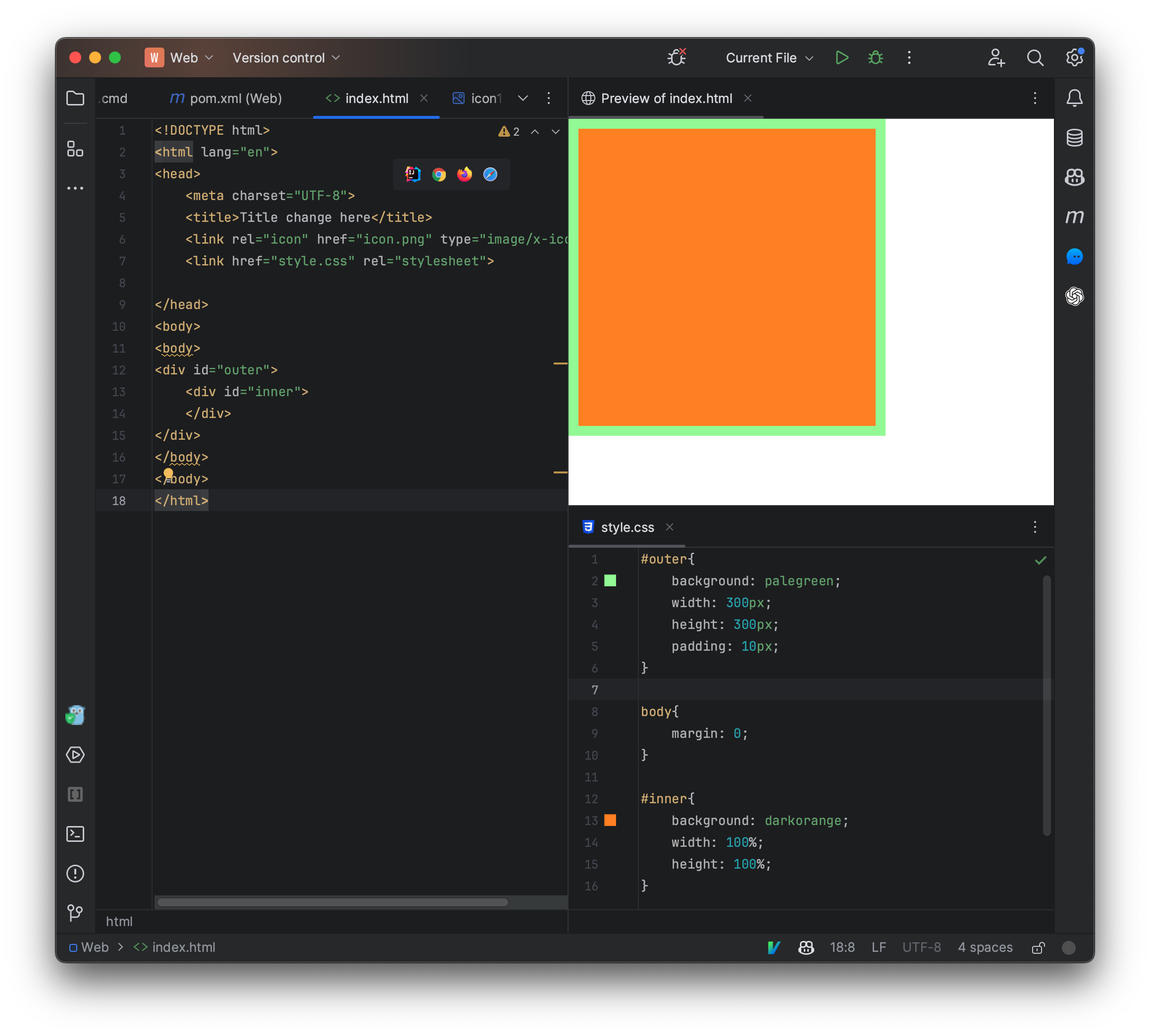
现在我们发现内部的div元素位于右上角,我们还可以以百分比的形式来指定大小:
百分比会依照当前可用大小来进行分配,比如当前位于一个div内部,并且外部div元素是固定大小300px,因此100%就相当于使用了外部的全部大小,也是300px,现在内部元素完全将外部元素覆盖了,整个元素现在呈现为橙色。
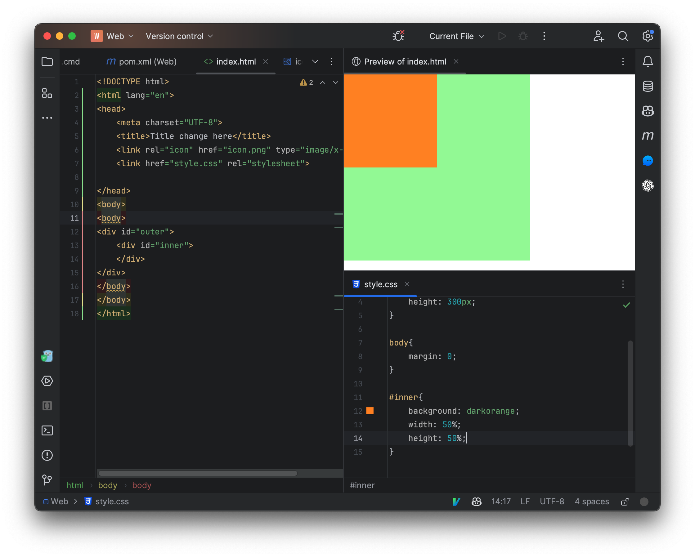
我们可以为一个元素设定边距,边距分为外边距和内边距,外部元素内边距决定了内部元素与外部元素之间的间隔,我们来修改一下css样式:
我们发现,内部的div元素小了一圈,这是因为外部div元素设定了内边距,上下左右都被设定为10px大小。
而我们发现,实际上我们在一开始也是将body的外边距设定为了0,整个页面跟浏览器窗口直接间隔0px的宽度。
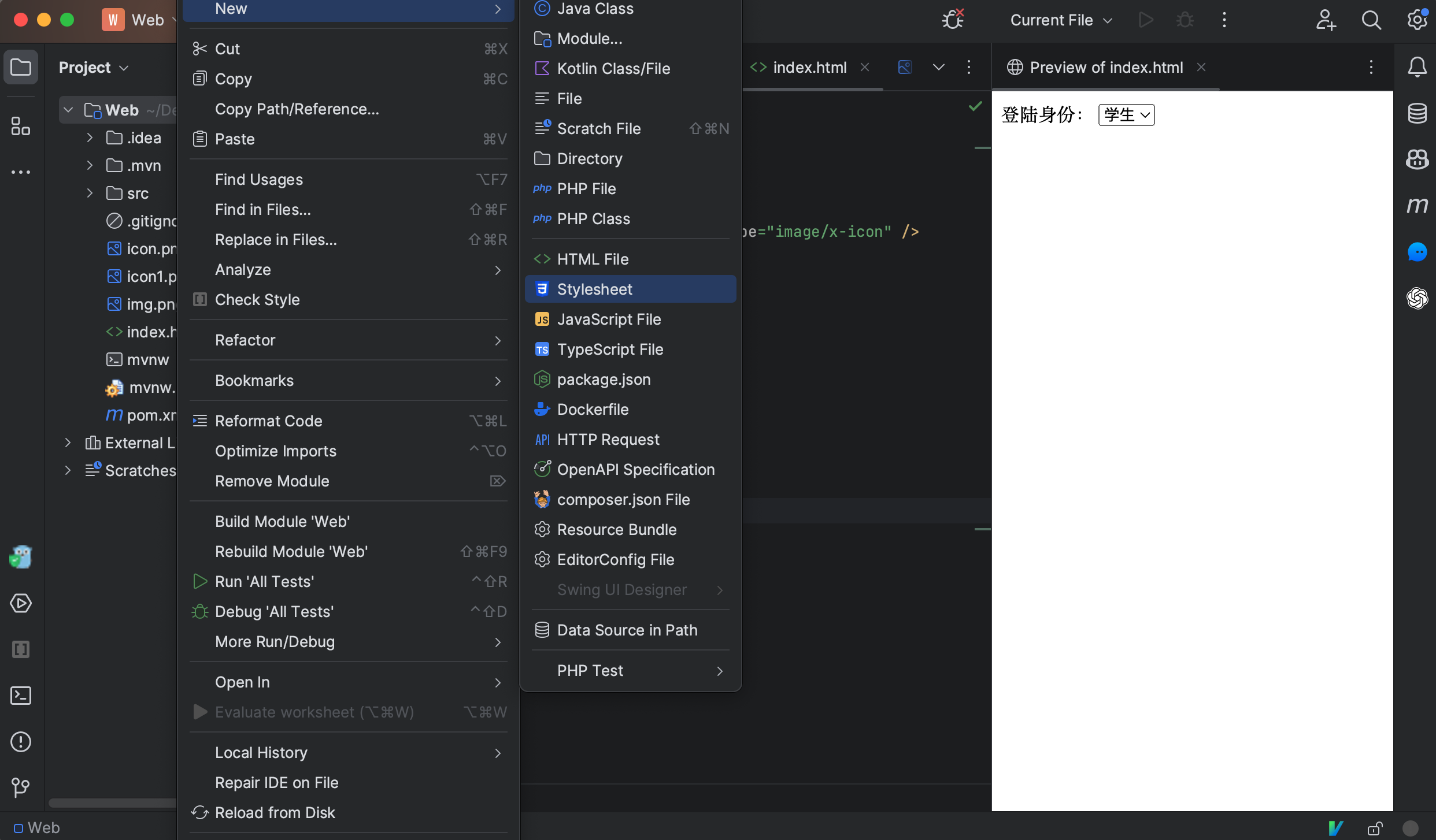
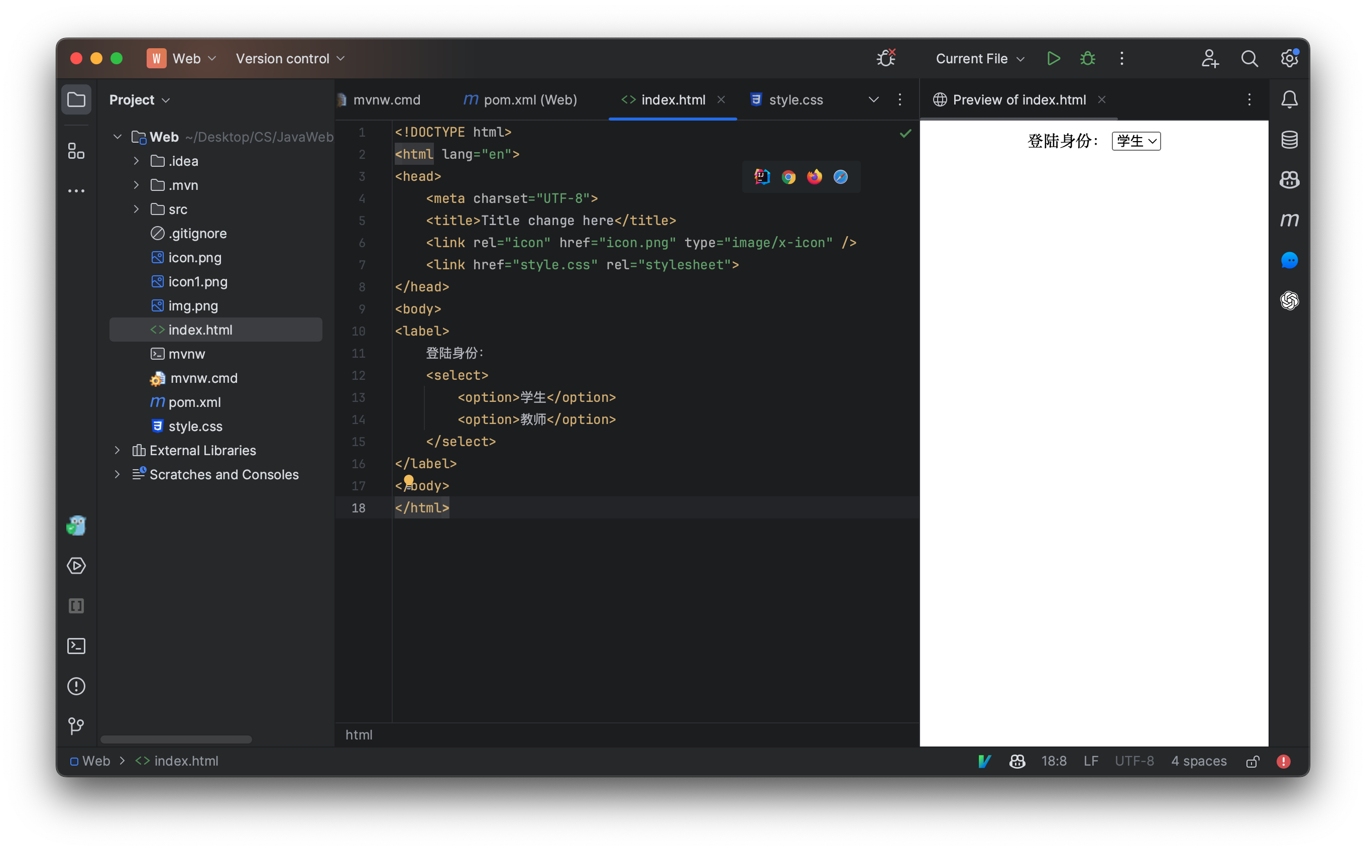
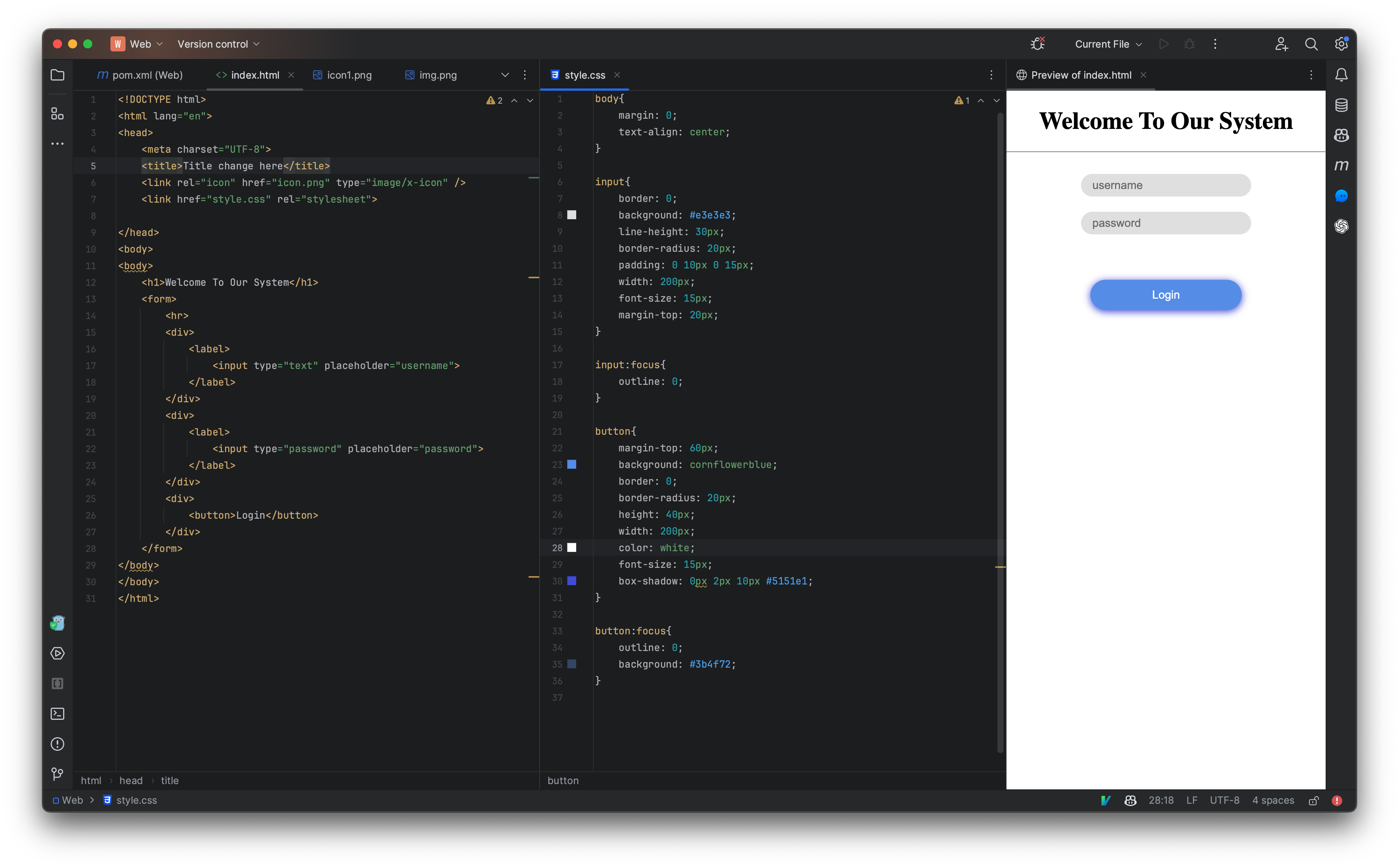
编写一个漂亮的登陆界面
<!DOCTYPE html>
<html lang="en">
<head>
    <meta charset="UTF-8">
    <title>Title change here</title>
    <link rel="icon" href="icon.png" type="image/x-icon" />
    <link href="style.css" rel="stylesheet">

</head>
<body>
<body>
    <h1>Welcome To Our System</h1>
    <form>
        <hr>
        <div>
            <label>
                <input type="text" placeholder="username">
            </label>
        </div>
        <div>
            <label>
                <input type="password" placeholder="password">
            </label>
        </div>
        <div>
            <button>Login</button>
        </div>
    </form>
</body>
</body>
</html>
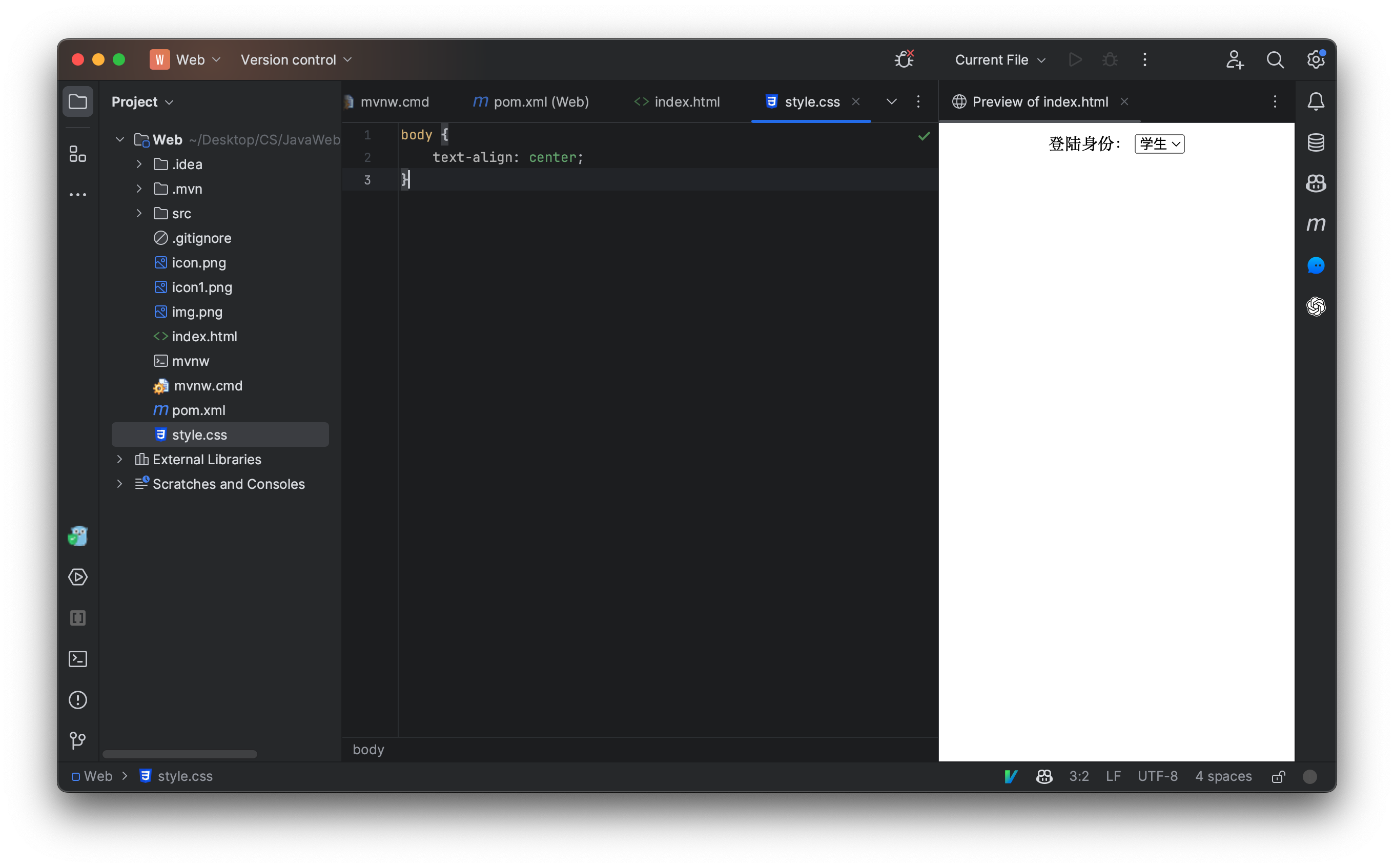
body{
    margin: 0;
    text-align: center;
}

input{
    border: 0;
    background: #e3e3e3;
    line-height: 30px;
    border-radius: 20px;
    padding: 0 10px 0 15px;
    width: 200px;
    font-size: 15px;
    margin-top: 20px;
}

input:focus{
    outline: 0;
}

button{
    margin-top: 60px;
    background: cornflowerblue;
    border: 0;
    border-radius: 20px;
    height: 40px;
    width: 200px;
    color: white;
    font-size: 15px;
    box-shadow: 0px 2px 10px #5151e1;
}

button:focus{
    outline: 0;
    background: #3b4f72;
}
JavaScript语言
也称为js,是我们整个前端基础的重点内容,只有了解了JavaScript语言,我们才能了解前端如何与后端交互。
JavaScript与Java没有毛关系,仅仅只是名字中包含了Java而已,跟Java比起来,它更像Python,它是一门解释型语言,不需要进行编译,它甚至可以直接在浏览器的命令窗口中运行。
它相当于是前端静态页面的一个补充,它可以让一个普通的页面在后台执行一些程序,比如我们点击一个按钮,我们可能希望执行某些操作,比如下载文件、页面跳转、页面弹窗、进行登陆等,都可以使用JavaScript来帮助我们实现。
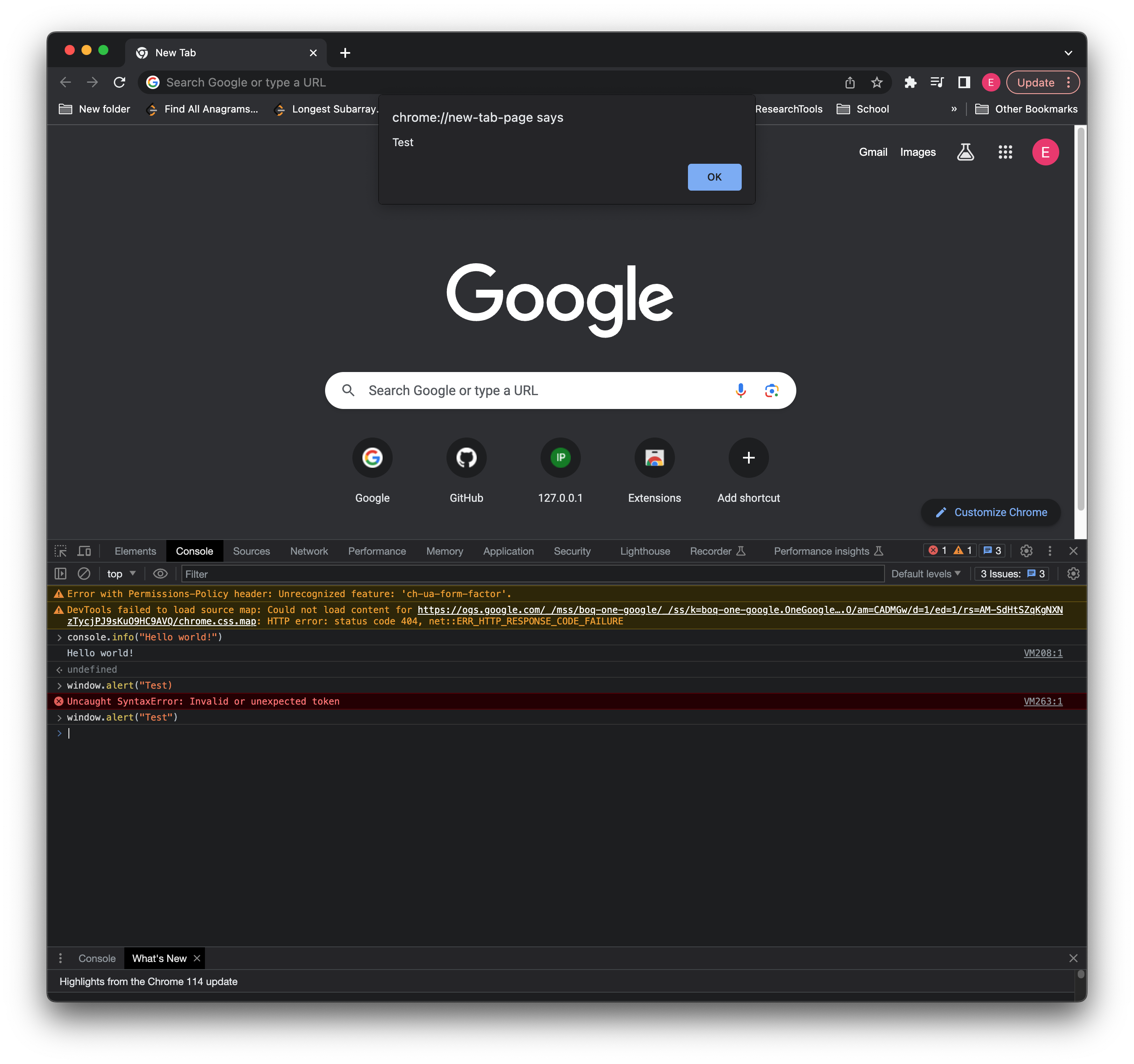
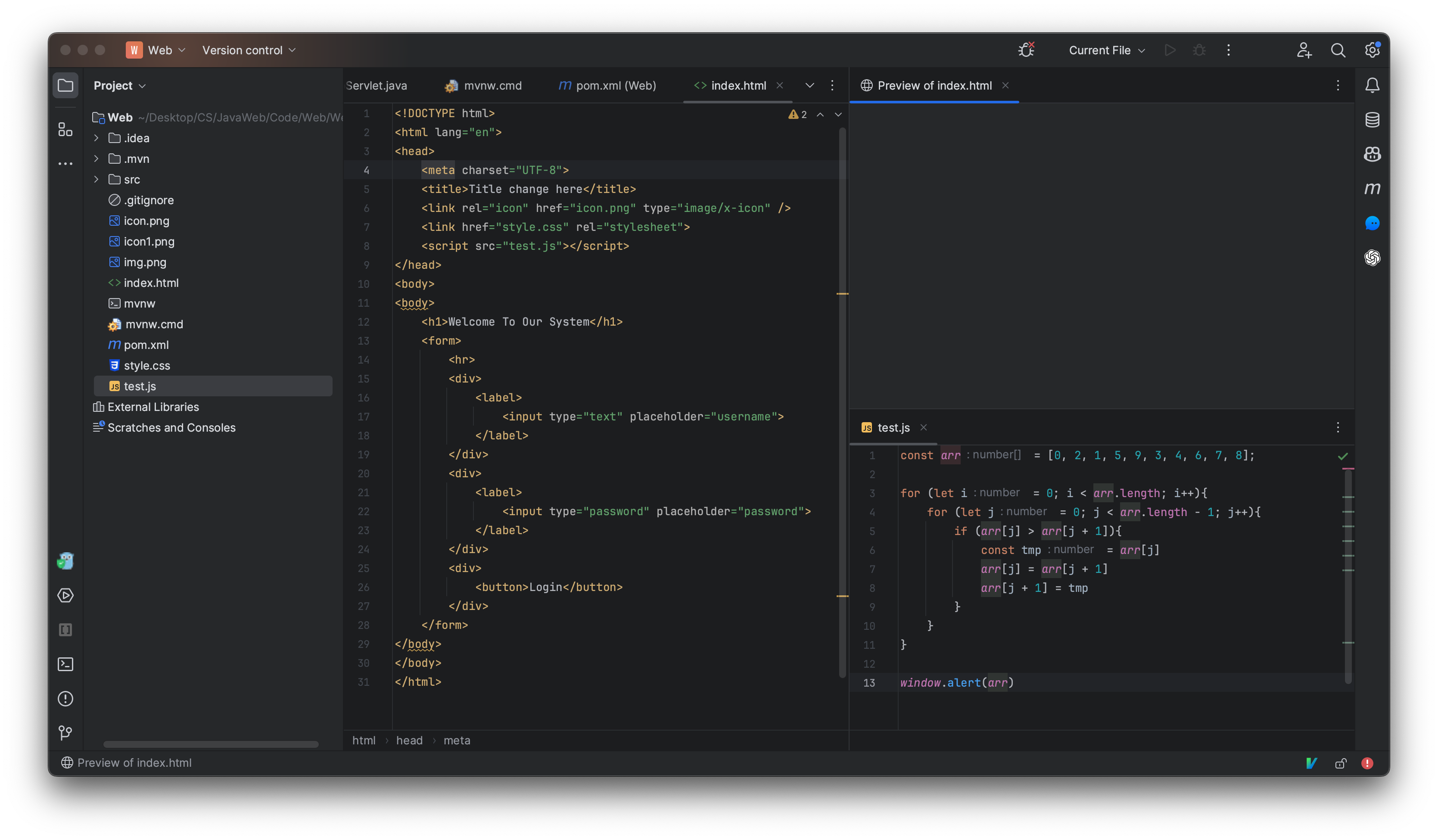
我们来看看一个简单的JavaScript程序:
const arr = [0, 2, 1, 5, 9, 3, 4, 6, 7, 8]

for (let i = 0; i < arr.length; i++) {
    for (let j = 0; j < arr.length - 1; j++) {
        if(arr[j] > arr[j+1]){
            const tmp = arr[j]
            arr[j] = arr[j+1]
            arr[j+1] = tmp
        }
    }
}

window.alert(arr)
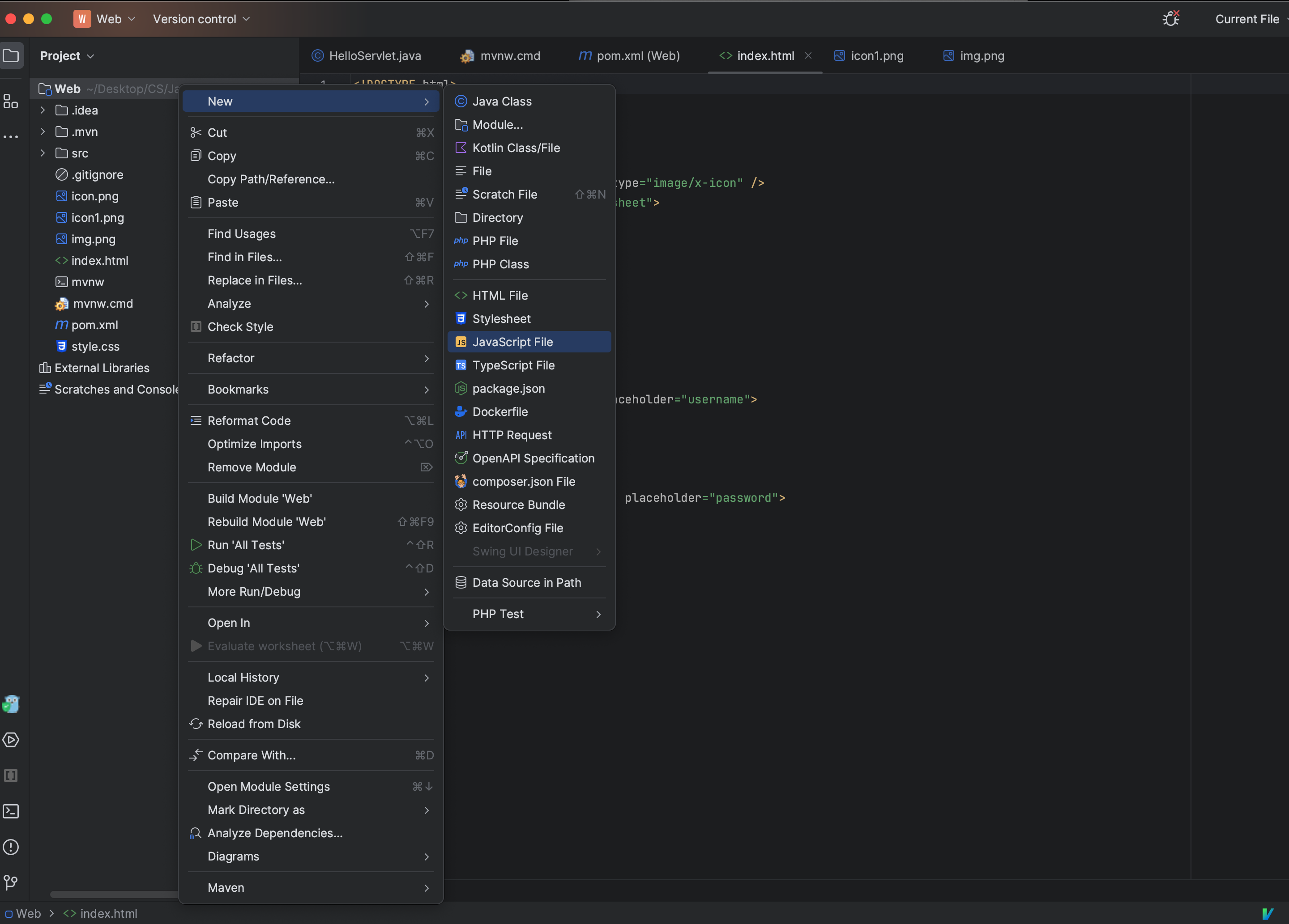
这段代码实际上就是实现了一个冒泡排序算法,我们可以直接在页面的头部中引用此js文件,浏览器会在加载时自动执行js文件中编写的内容:
我们发现JS的语法和Java非常相似,但是它还是和Java存在一些不同之处,而且存在很多阴间语法,那么我们来看看JS的语法。